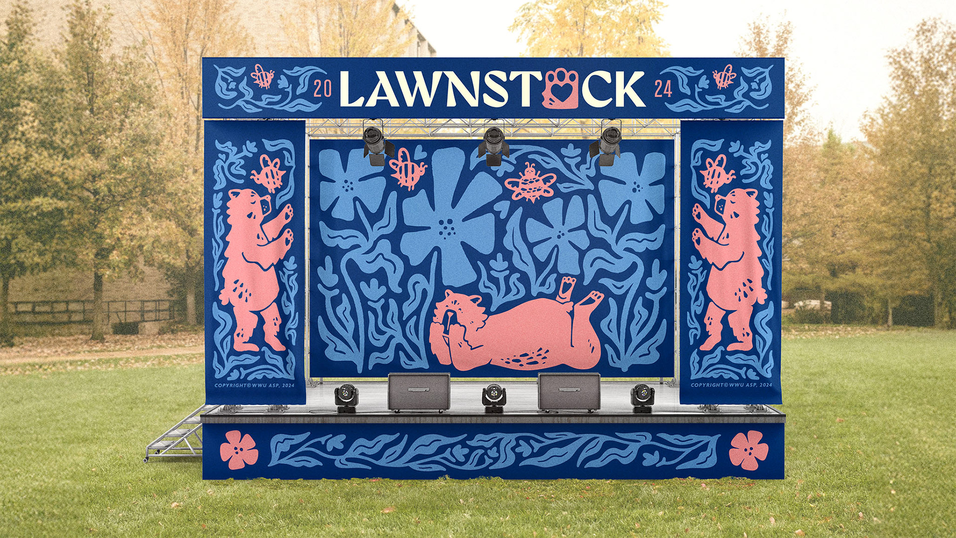
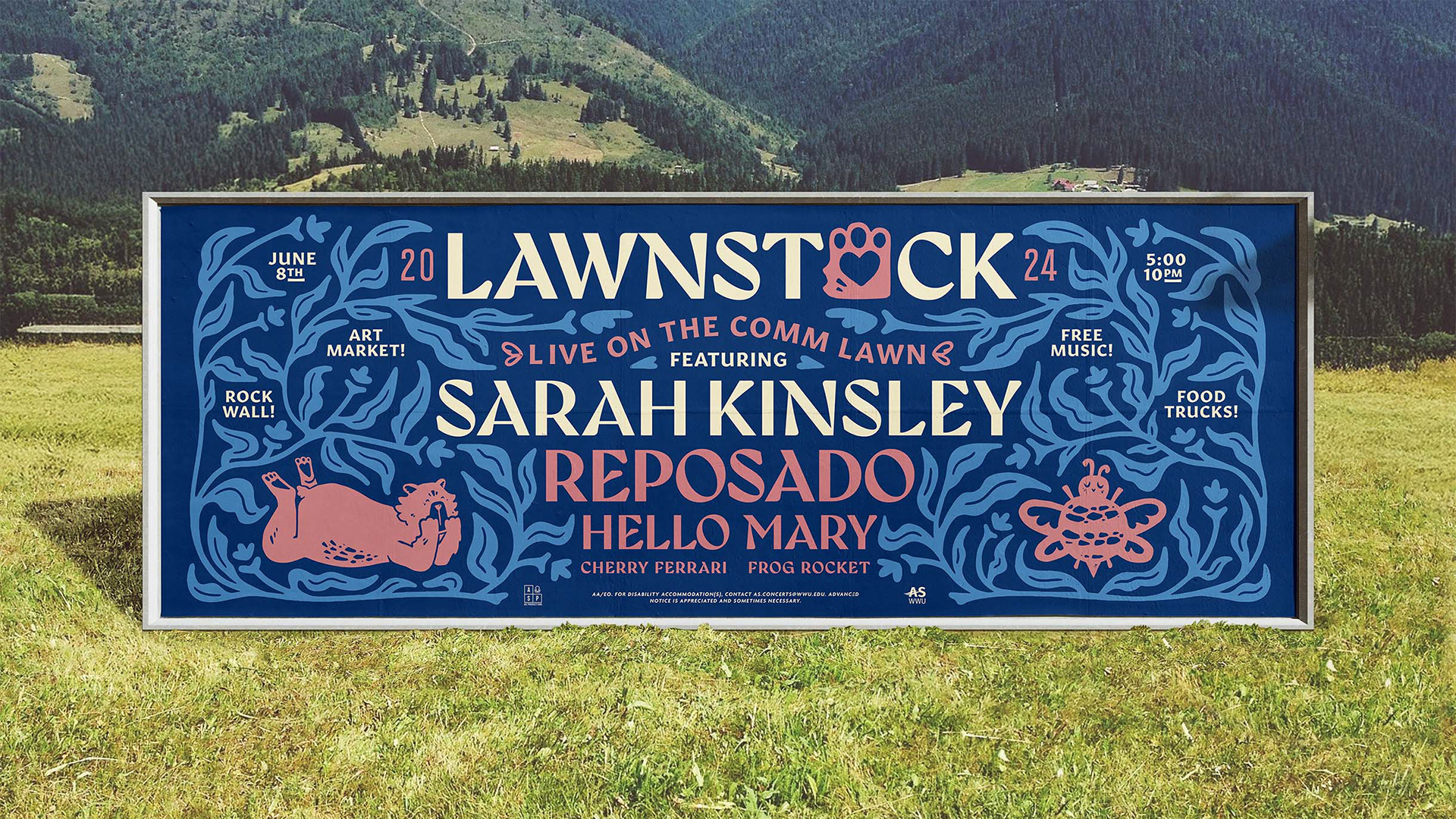
LAWNSTOCK 2024
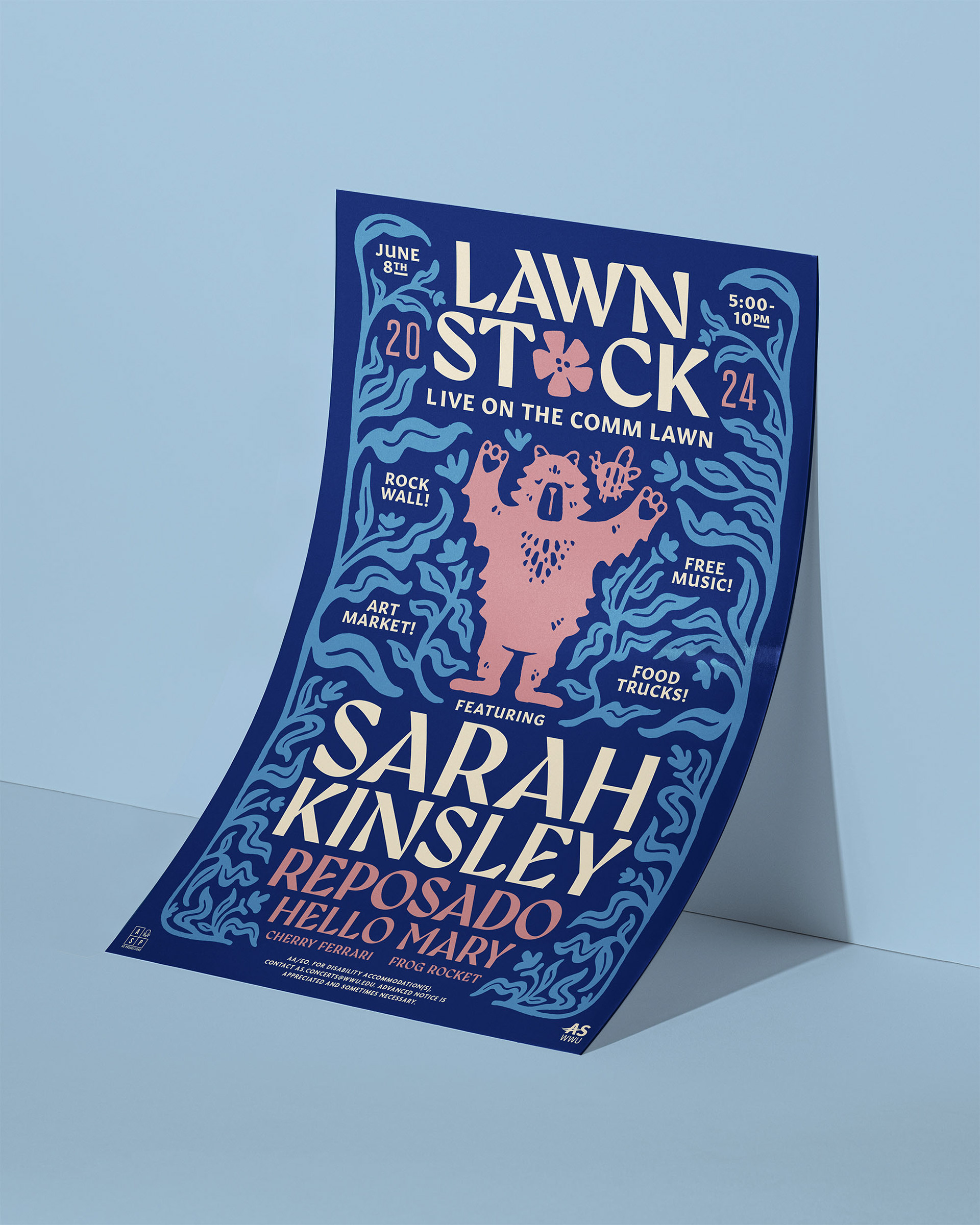
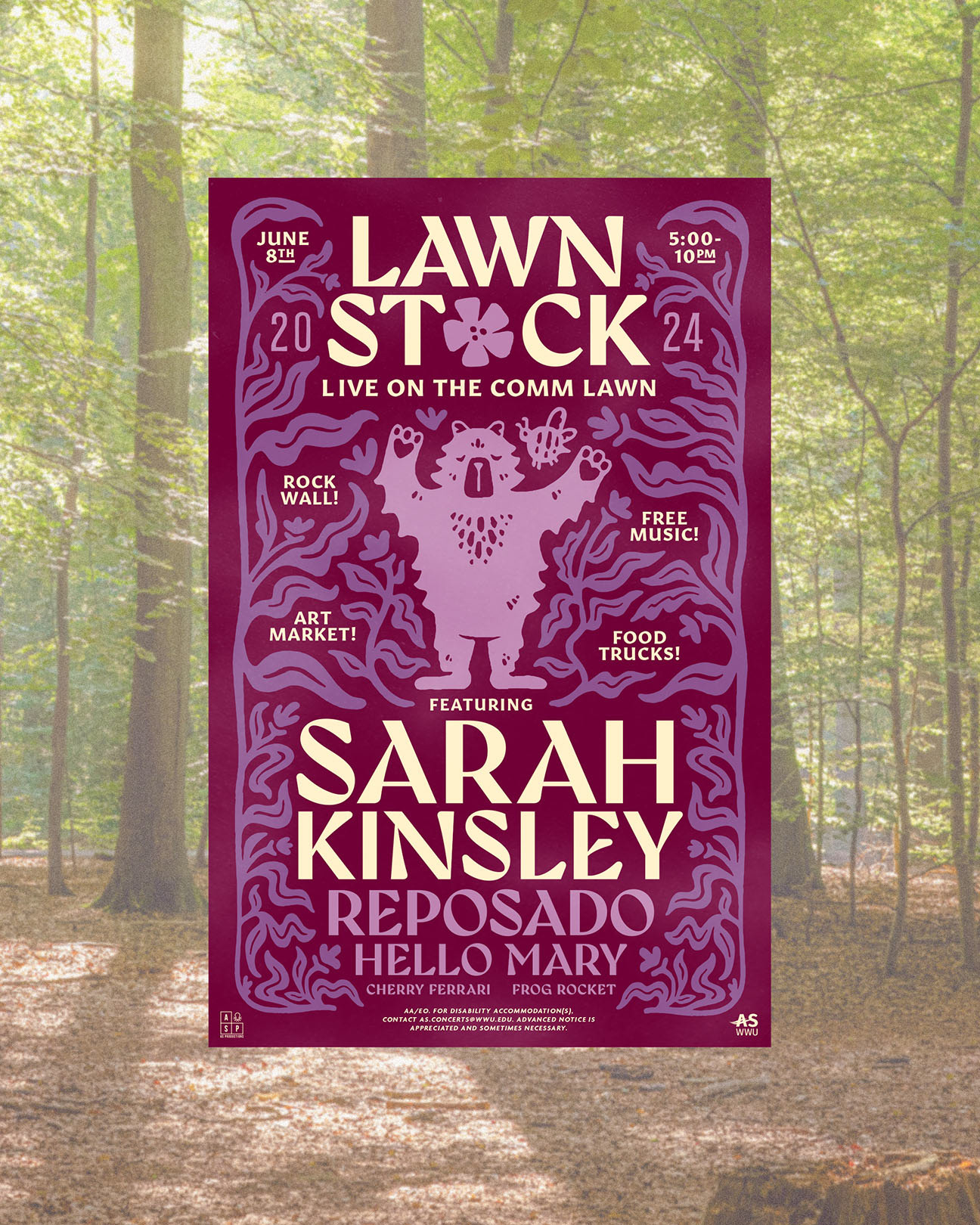
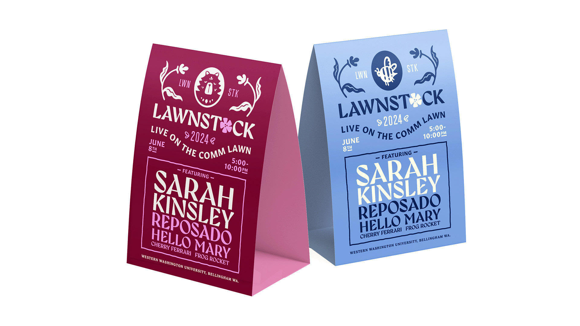
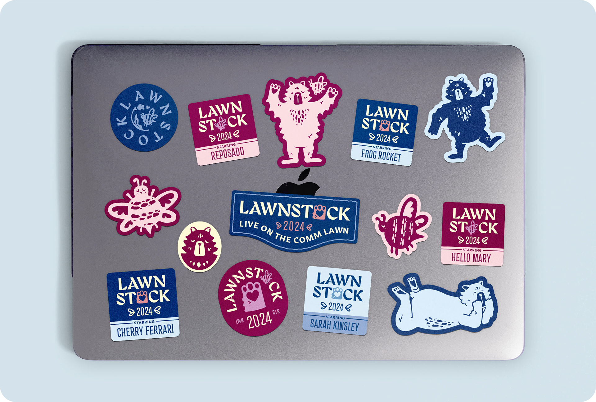
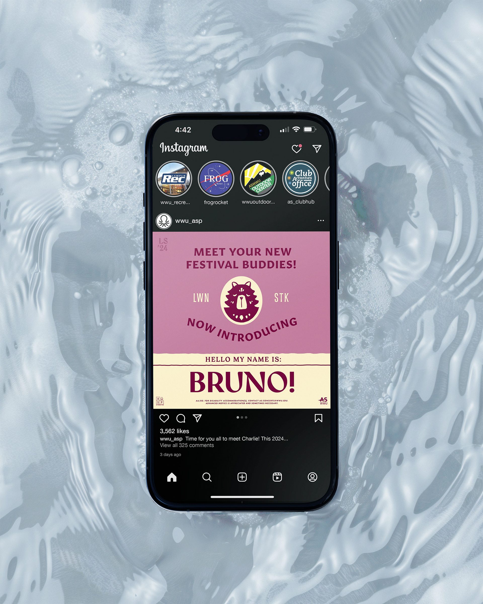
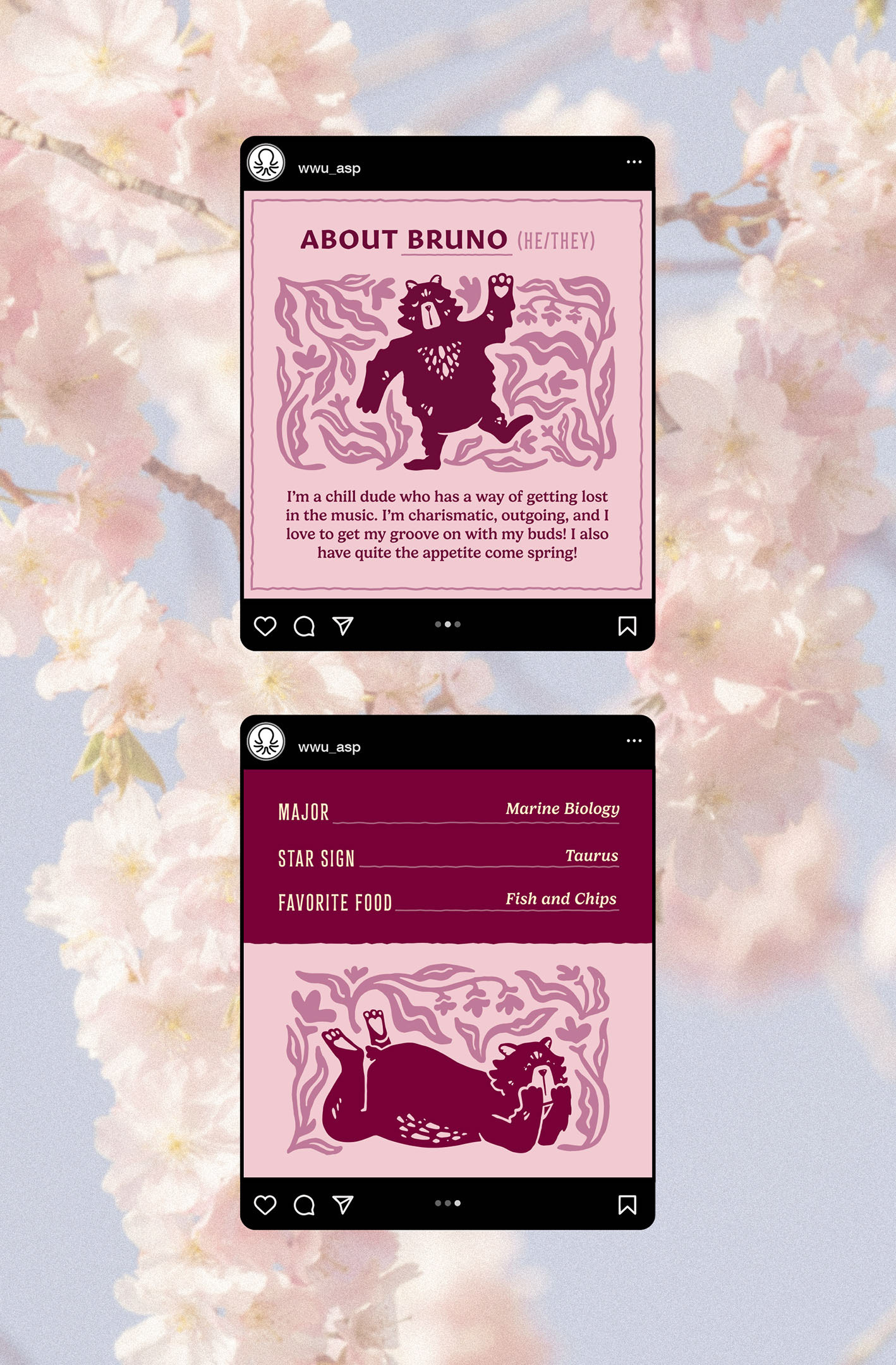
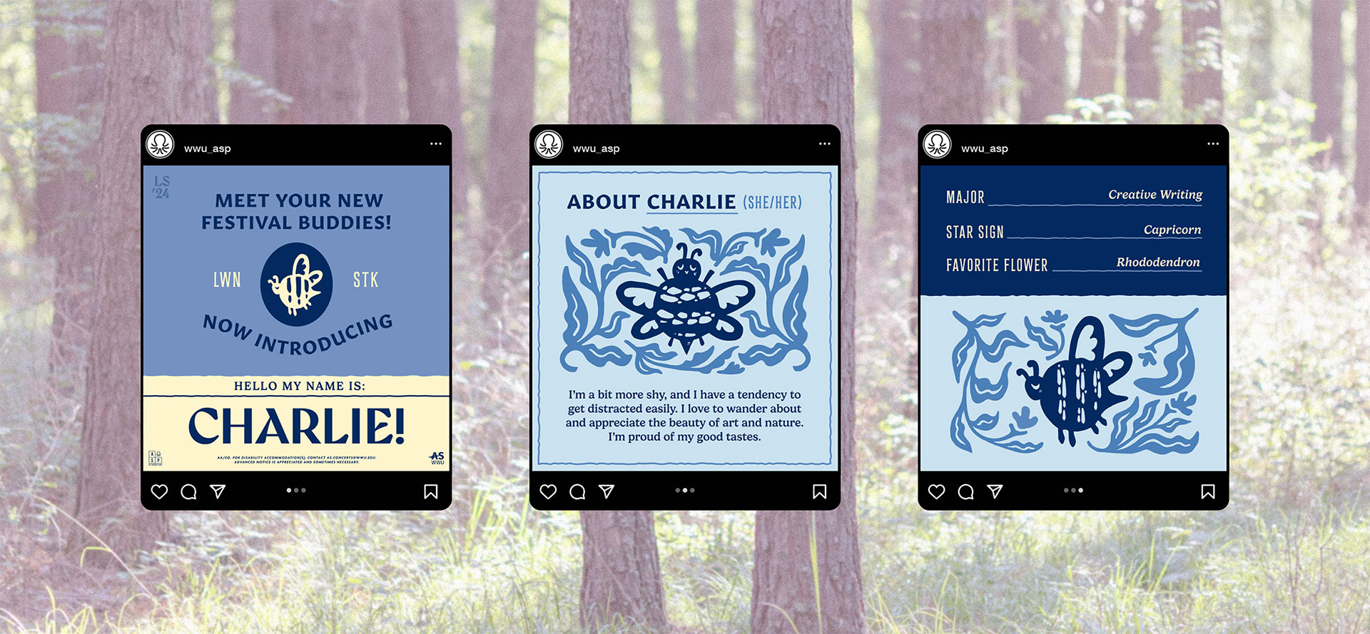
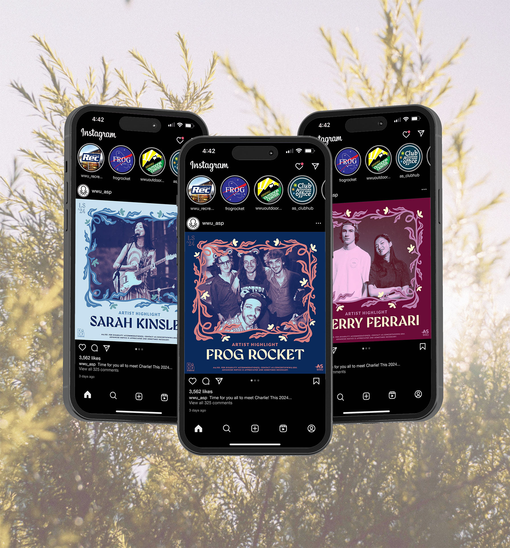
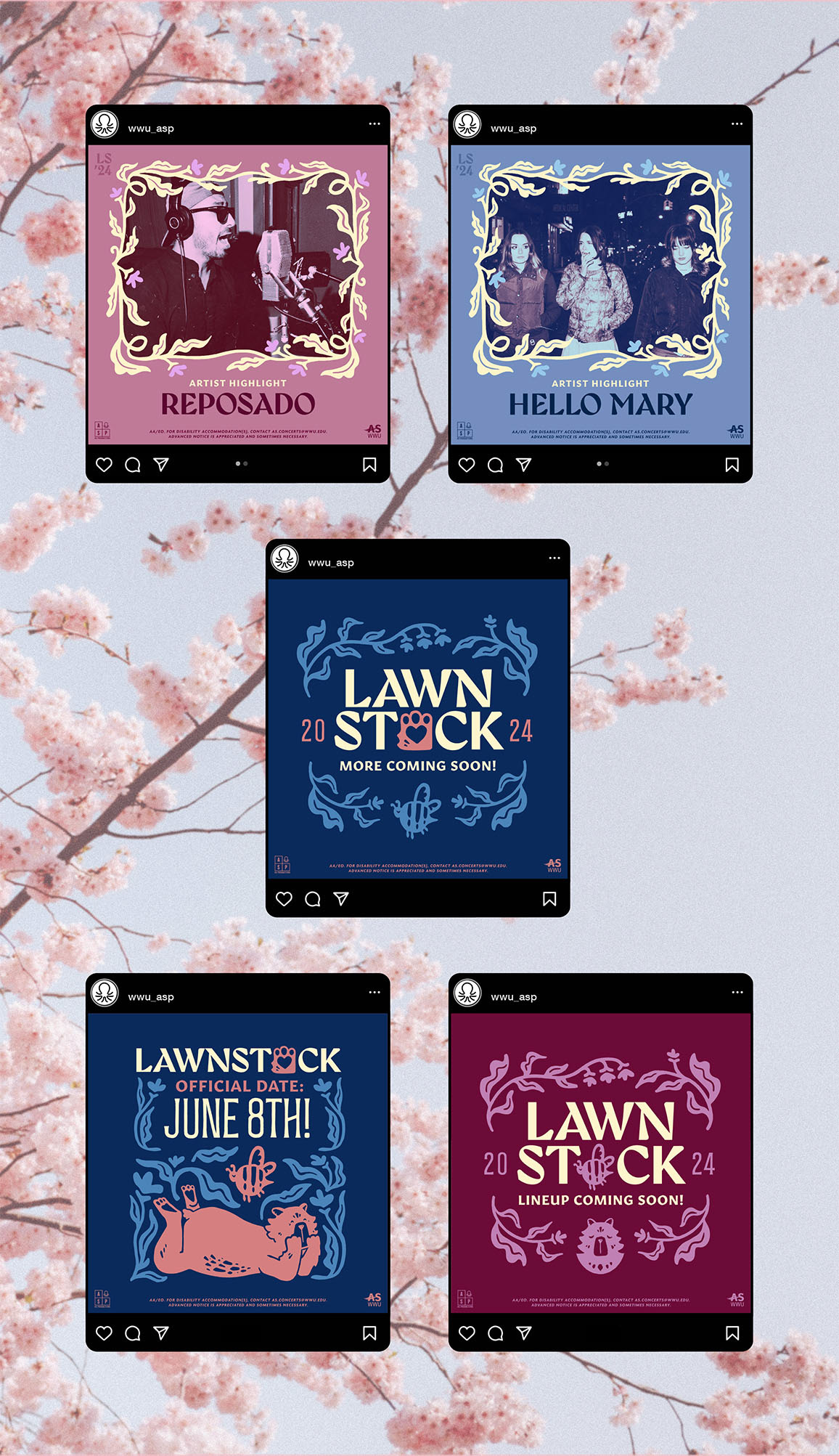
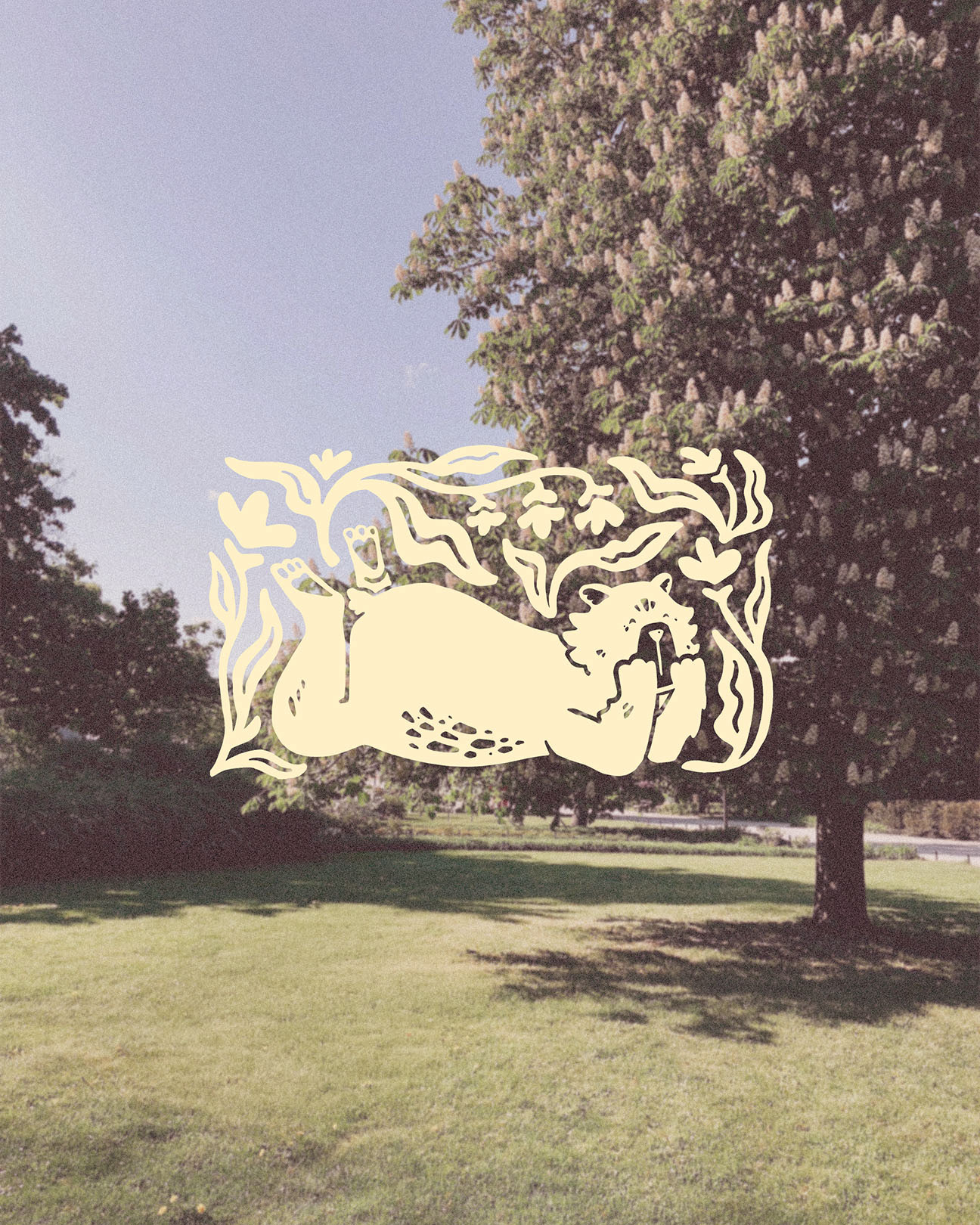
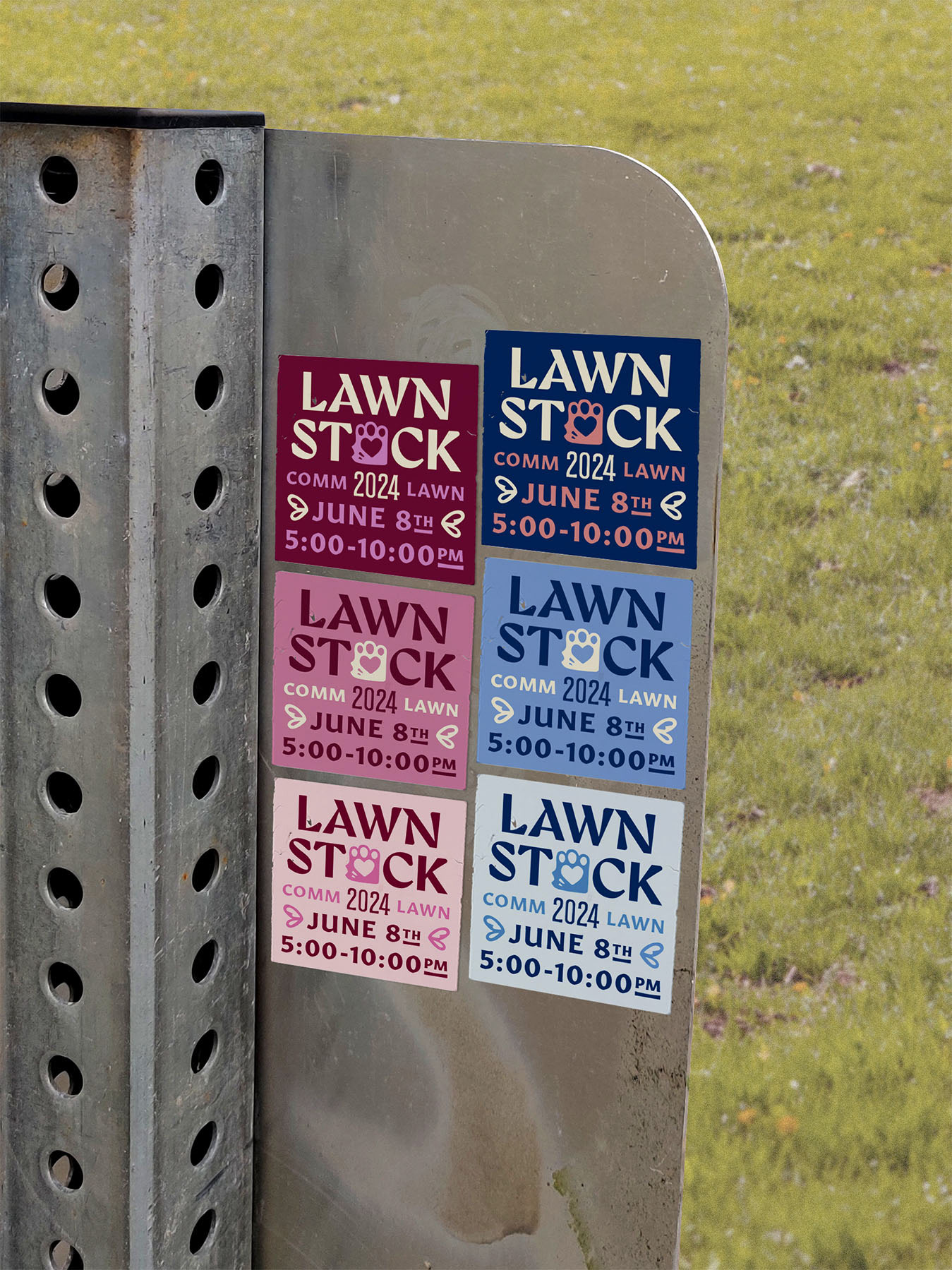
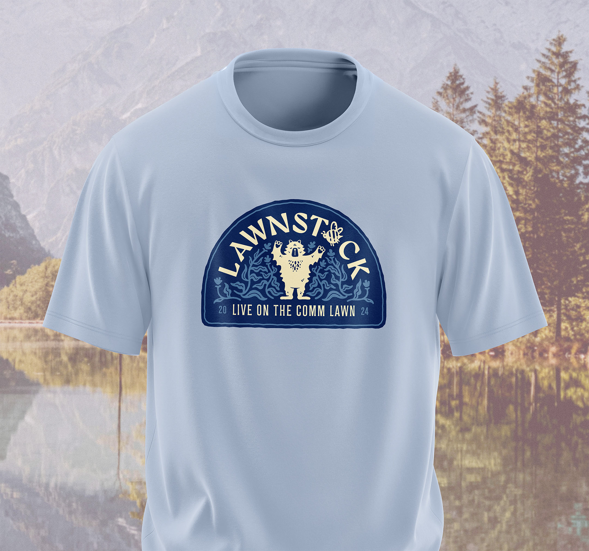
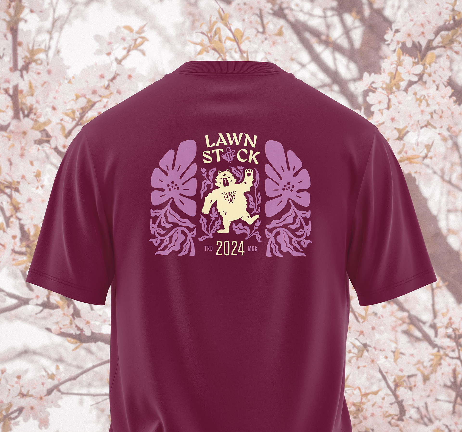
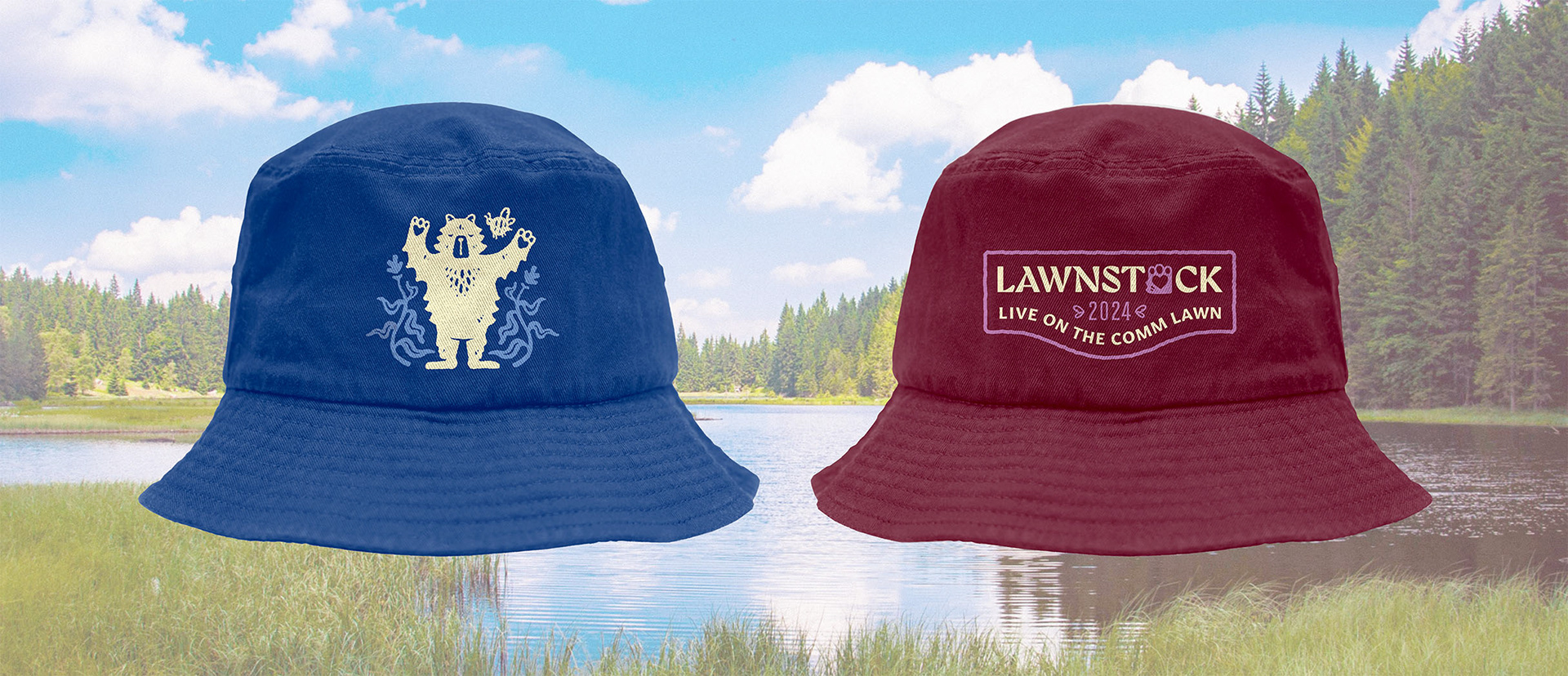
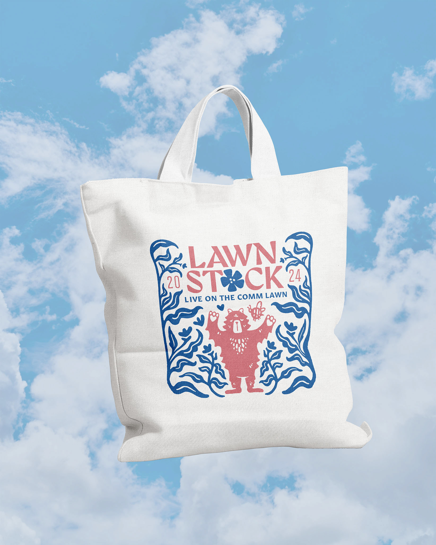
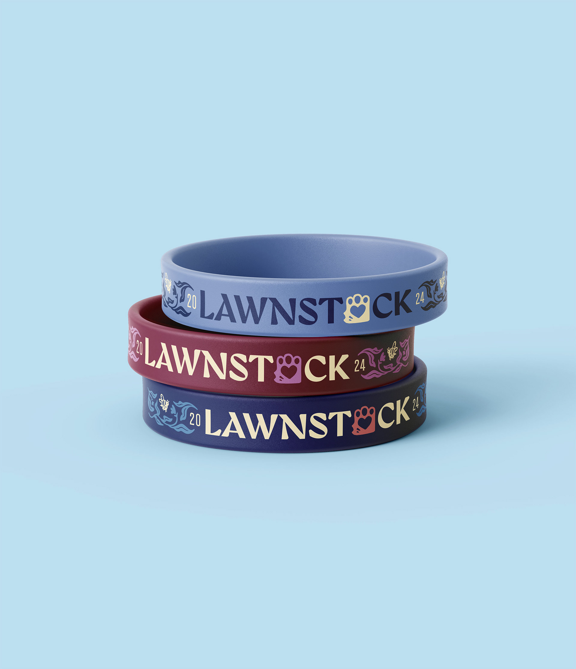
My friend Chloe and I made brand system centered around two charming mascots, to promote WWU's annual on-campus music festival. Come celebrate the local community and the arrival of spring with Bruno the Bear and Charlie the Bee!
COLLABORATOR: Chloe Unflat
MY ROLE: Typesetting, layout, color, & assistant illustrator.
.

THE DESIGN PROCESS
EARLY CONCEPT 1
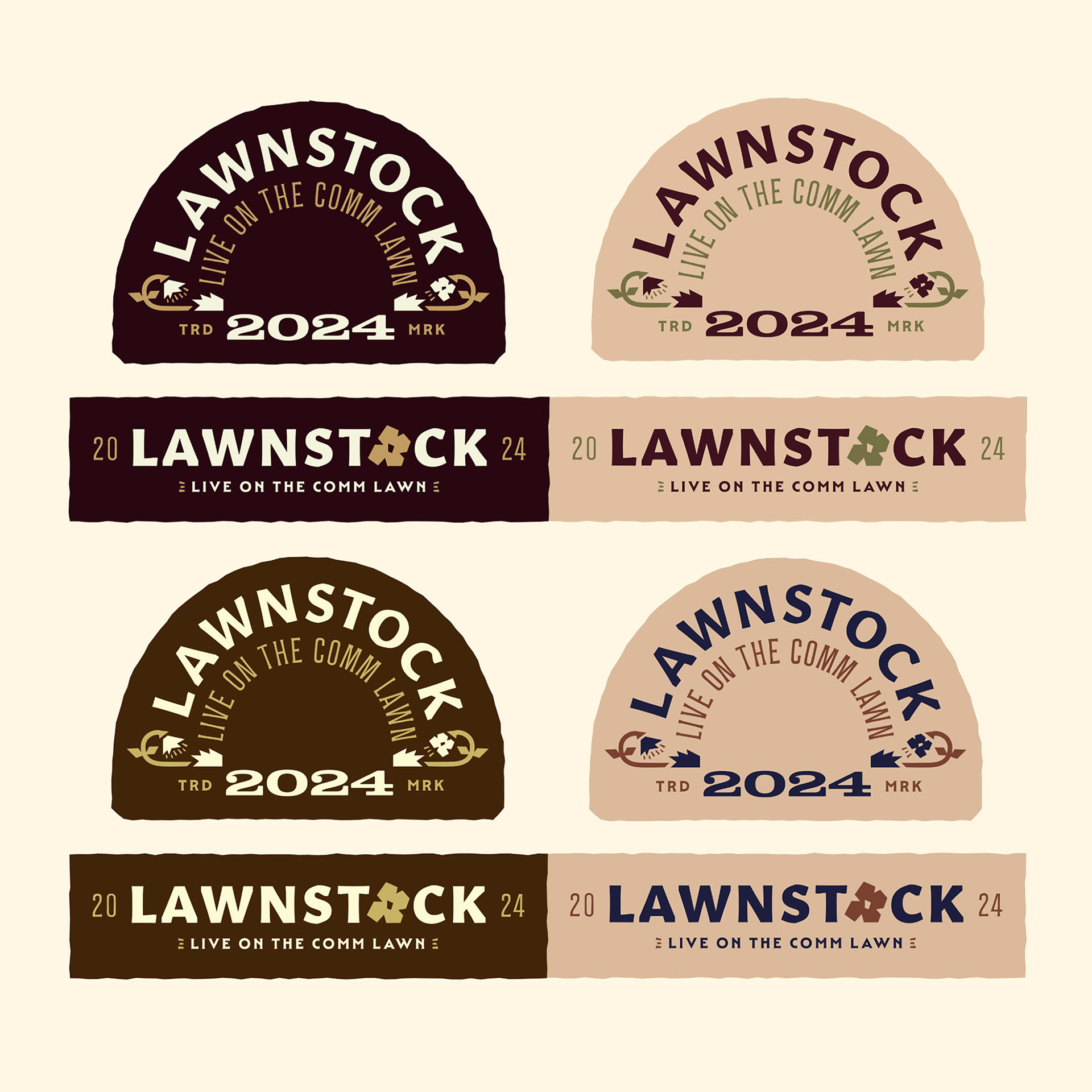
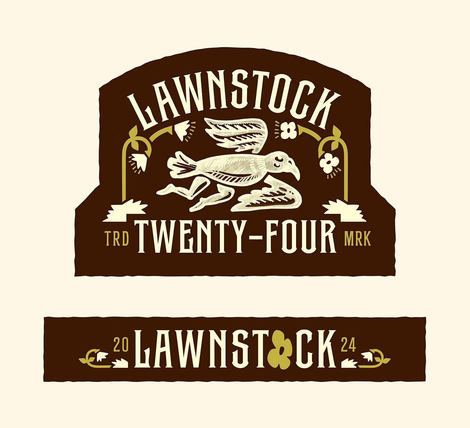
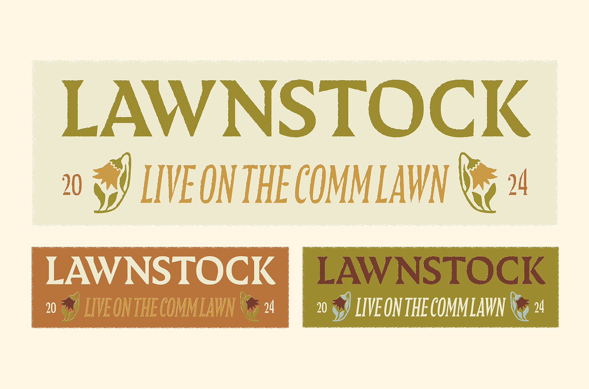
The first design direction we pitched was called "Community Arts and Crafts." The styling was based off of the arts and crafts movement, and it was supposed to appeal to the local art booths and community-oriented nature of the festival. Here are some early color schemes and concept designs. At this stage, our mascot was originally a crow character. The team felt it was well-made, and they liked the general composition. However, they said the colors and fonts felt a bit Celtic, which didn't align with the festival.
EARLY CONCEPT 2
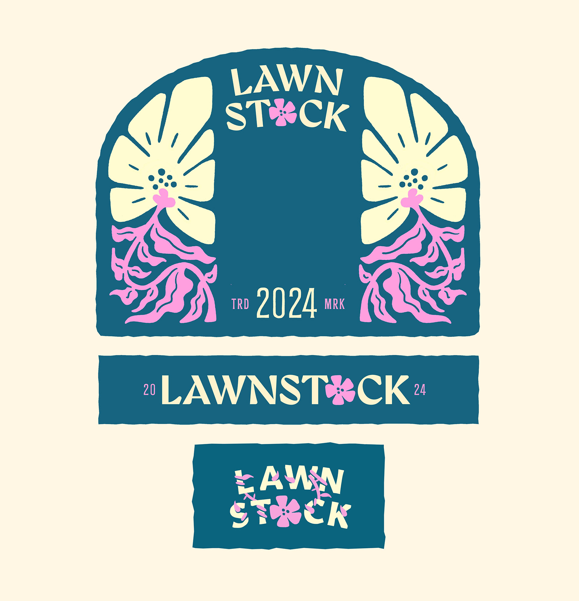
Our second direction was called, "A Punch of Spring." This direction was supposed to celebrate the warm weather and the arrival of springtime in Bellingham. After months of being cooped up indoors in the rain, finally the sun is out, and the cherry blossoms are in bloom. It's time to enjoy some live music and activities outdoors! When we pitched this direction, they really liked the concept and the flower illustrations. However, they found the colors were a bit de-saturated for the spring.
EARLY ITERATION 2
After showing the previous two directions, The WWU ASP team suggested we do a Frankenstein of both concepts. This led us to our final direction, "Flower Power," which combined the community-oriented and local nature of the event with a celebration of the season. In these early iterations, you can see us trying out more saturated and experimental palettes, as well as playing with various ways to integrate the type into the illustrations.
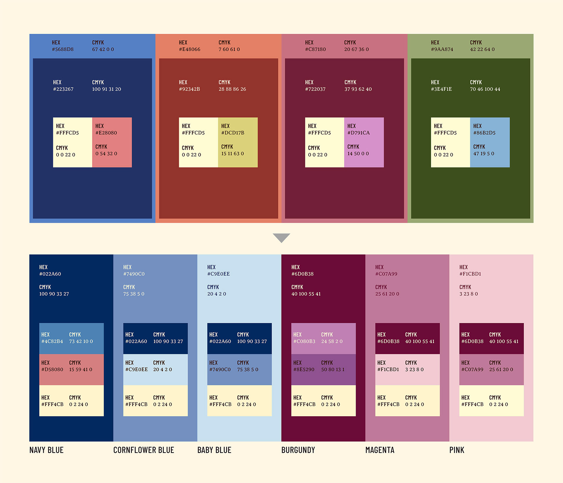
COLOR PALLETE
The top color palette was shown in the first revision pitch, to offer them a variety of options to choose from. The team agreed that the green felt overdone, and opted to choose the blue and maroon as the core brand colors. From there, we built out a versatile and multi-toned palette for each of the two colors, forming our final palette on the bottom. Treating color systematically really helped balance cohesion with variety in the final result.

