TUBS SUBS
In this project, I built out a bold and striking brand system for a family-owned sub shop that doesn't mess around with their gigantic selection of flavorful sandwiches. The goal was to build a brand that felt friendly, yet still high quality, centering variety and affordability as cornerstones of their voice.
SKILLS
Brand Systems, 3D Modeling, Typography, Typesetting, Illustration, Motion, & Web Branding
.
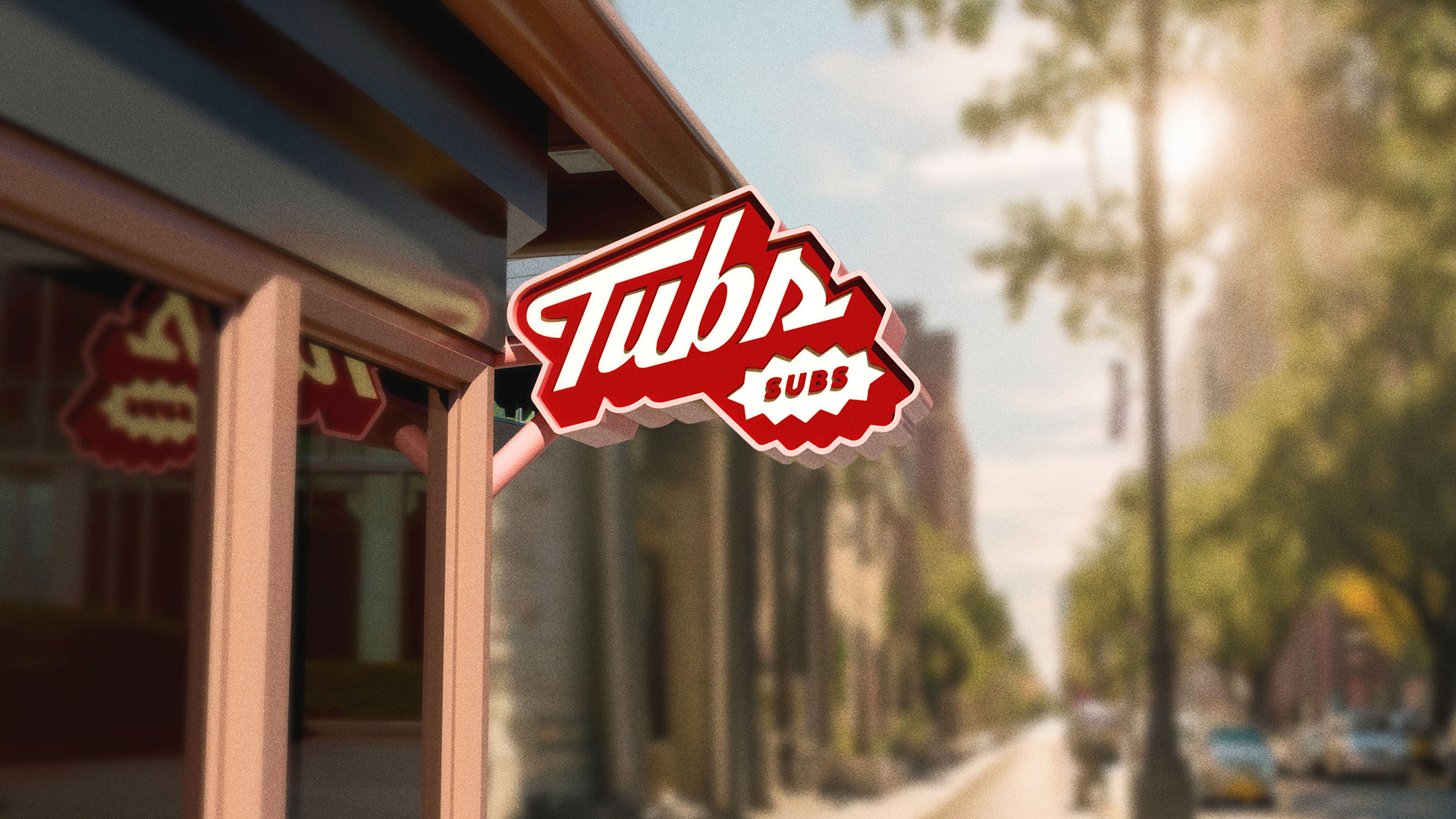
OUTDOOR LIGHTBOX SIGN, MADE IN CINEMA 4D

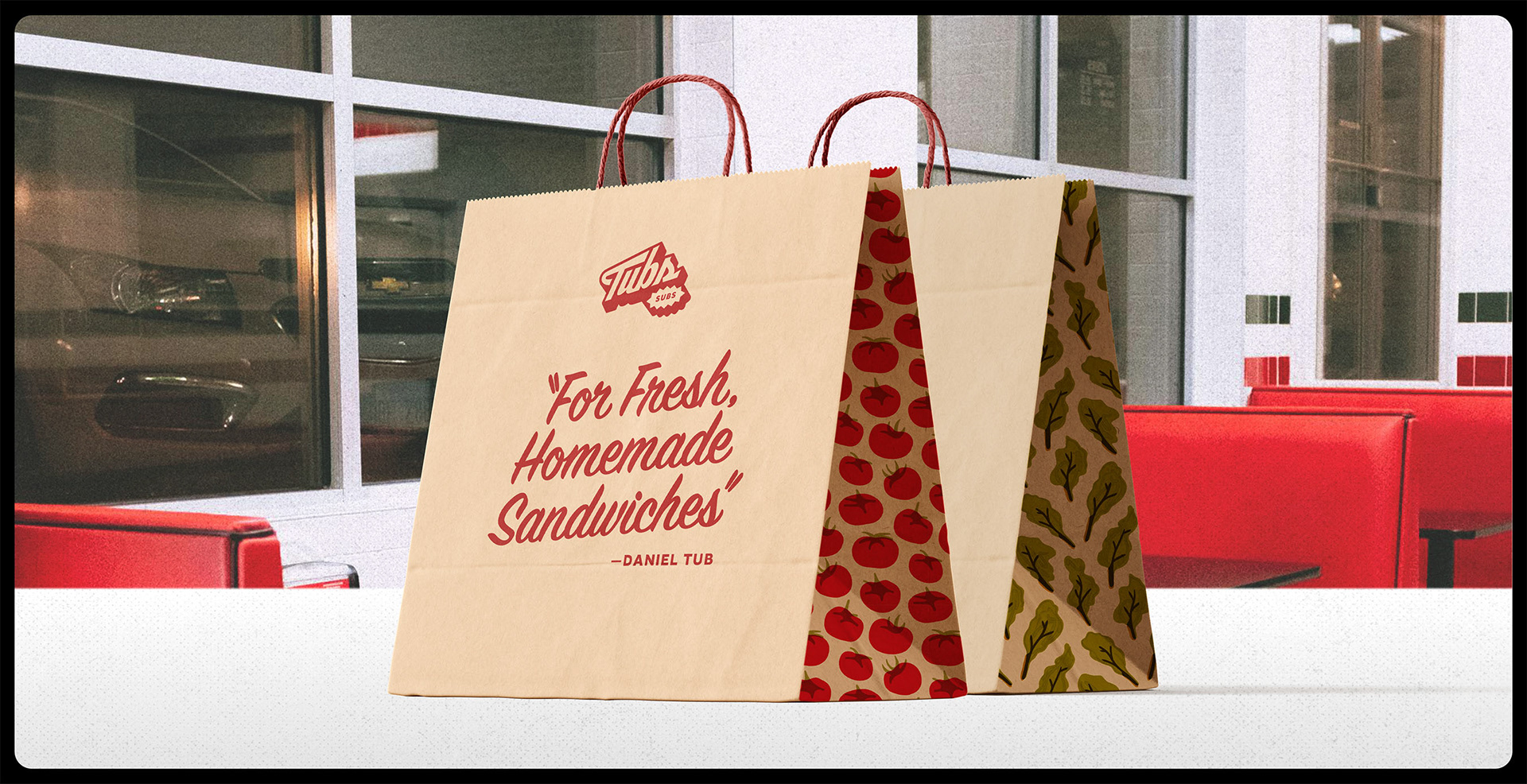
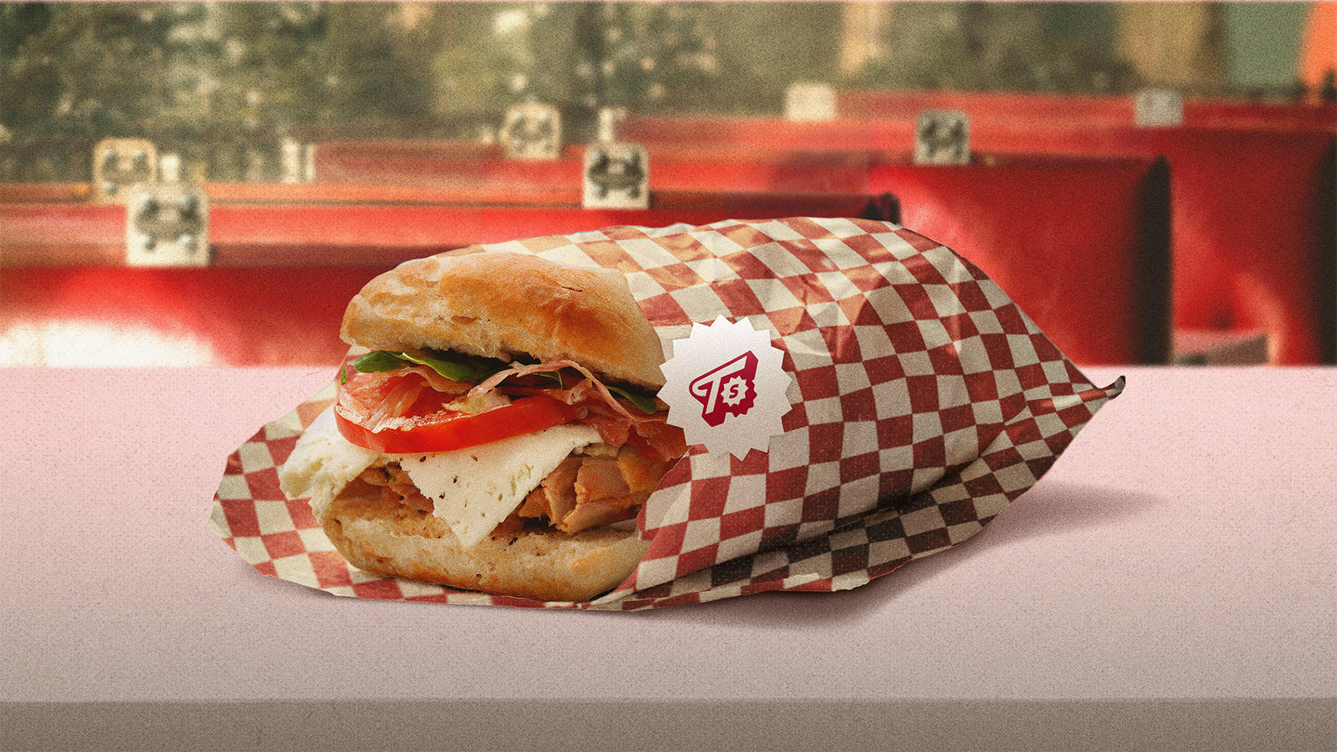
TAKE-OUT PAPER BAG

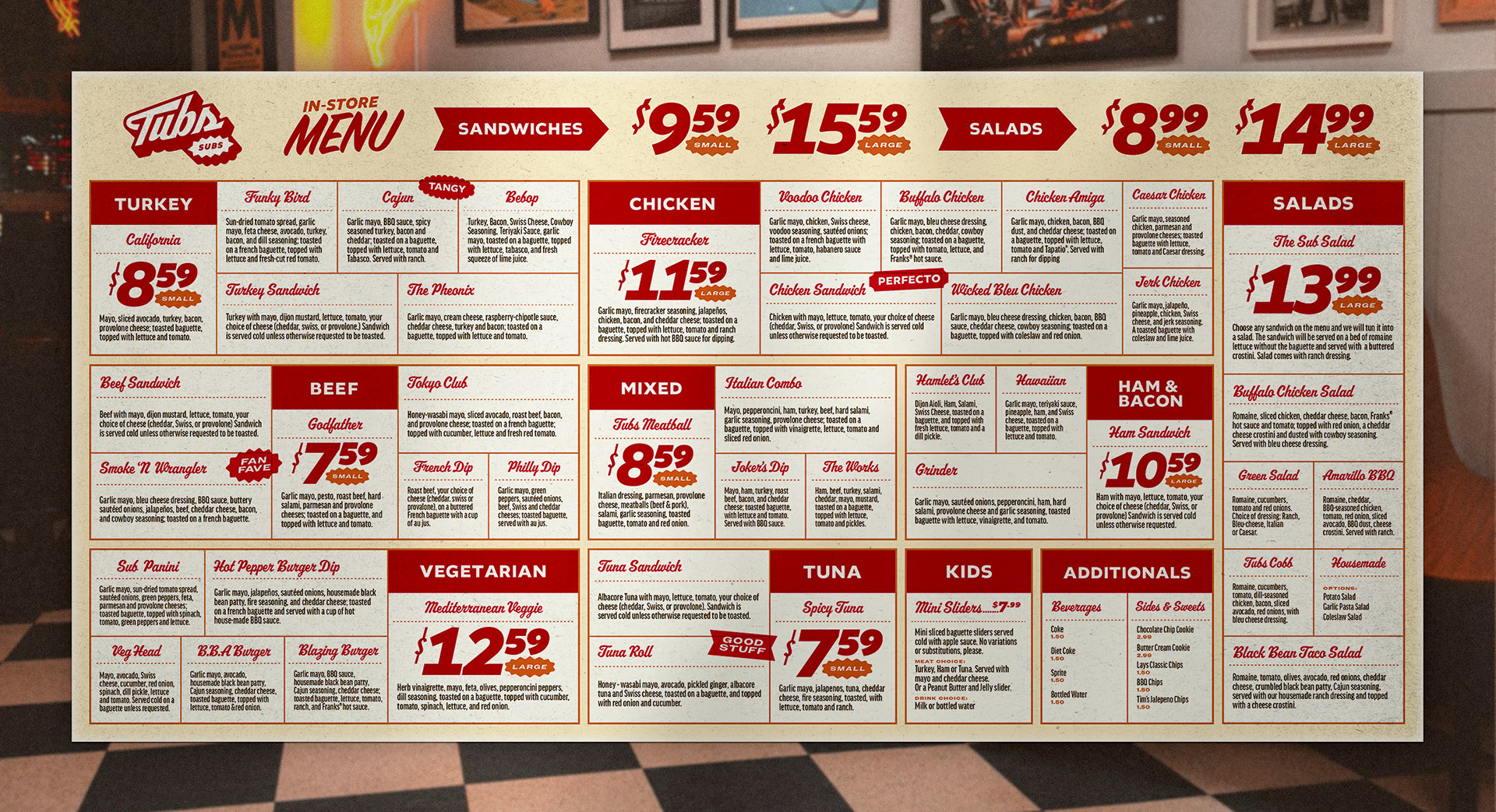
IN-STORE MENU SIGNAGE

IN-STORE HAND-HELD MENU

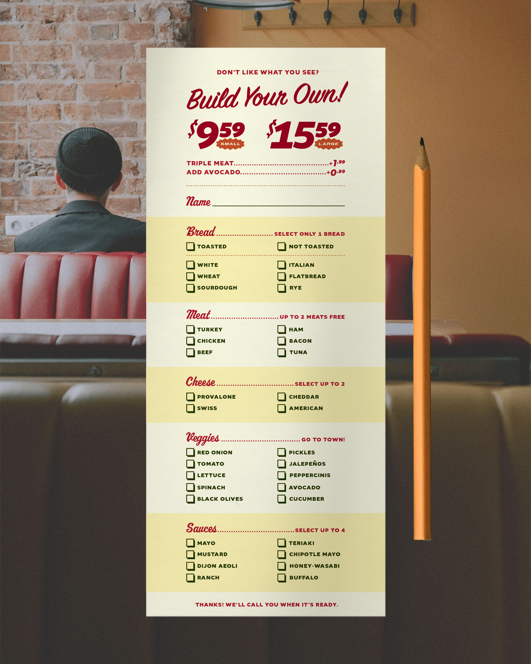
"MAKE YOUR OWN SANDWICH" SHEET


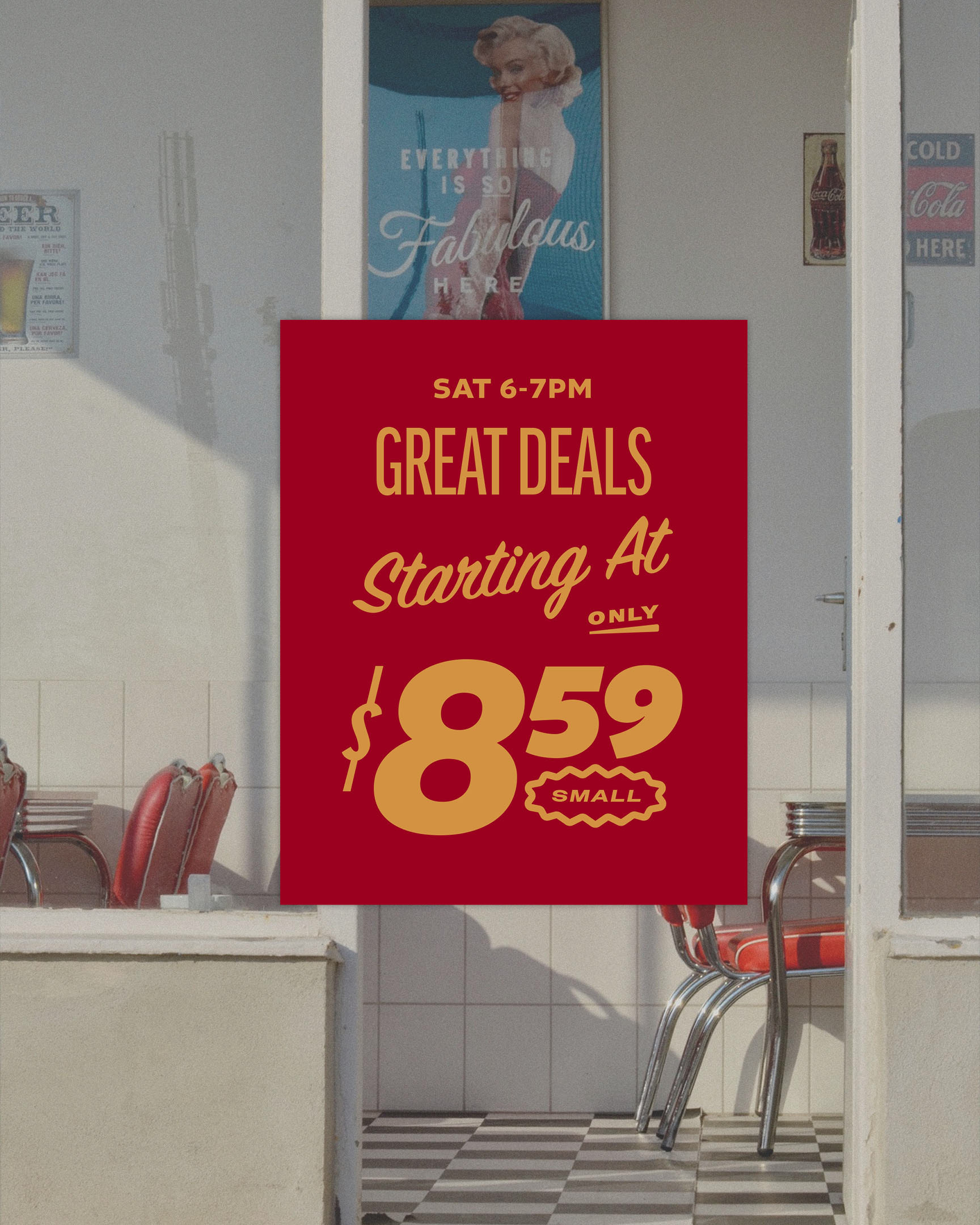
IN-STORE PROMOTIONAL ADVERTISEMENTS
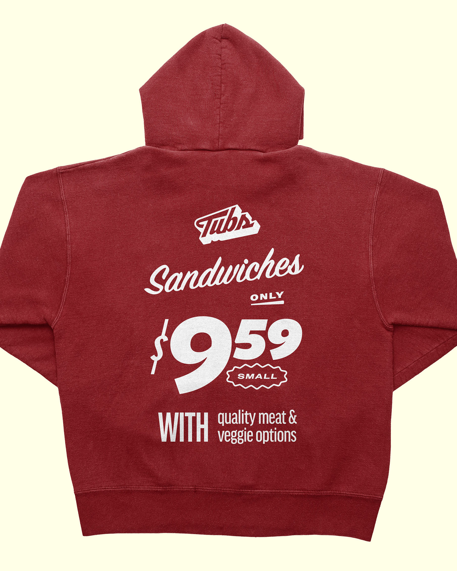
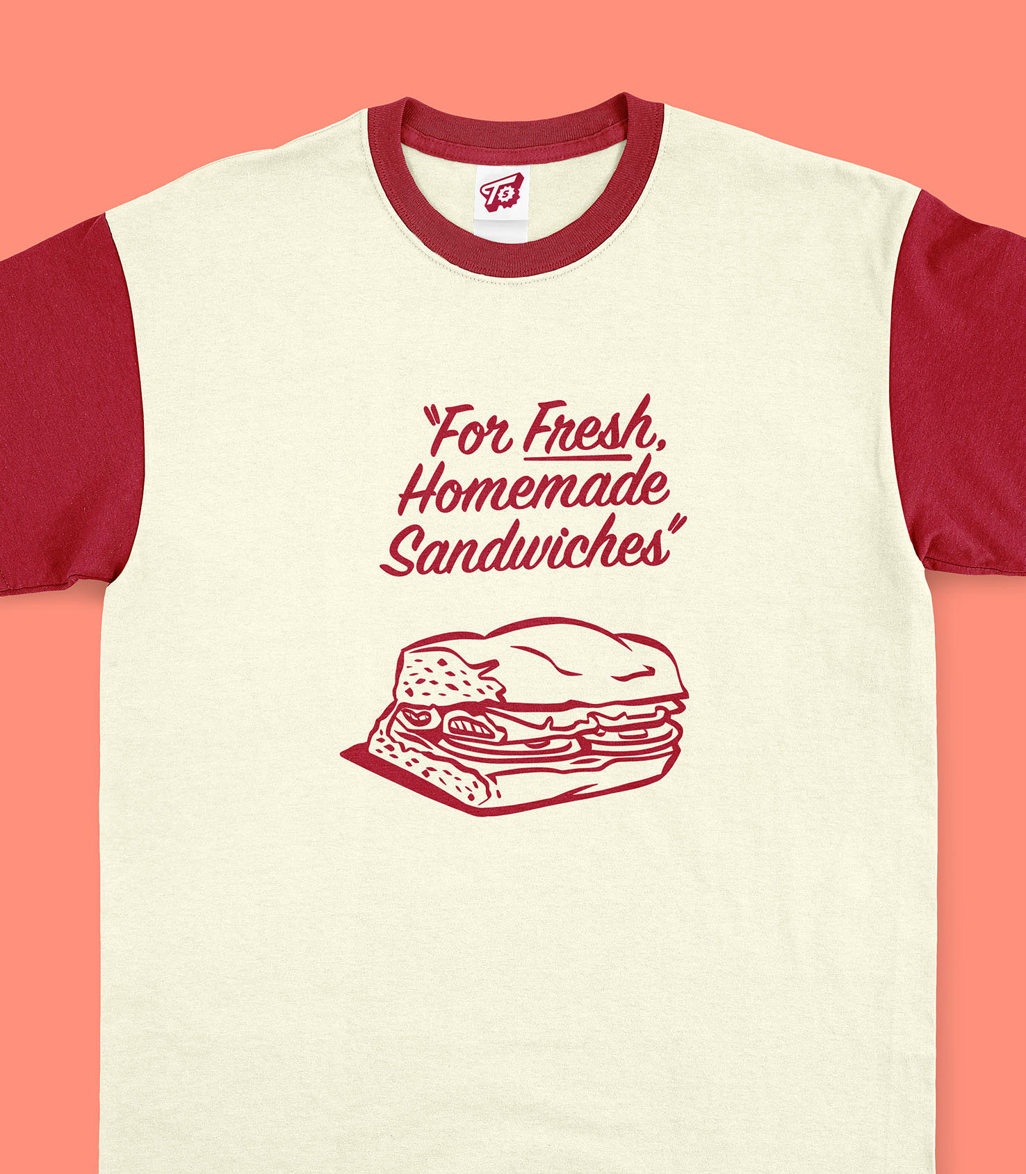
DESIGN PROCESS
This project began with extensive research of Tub's Subs, a local sandwich chain founded in 1983, with locations in Lynnwood and Bothell, WA. Tubs is proud of their gigantic food selection, with 37 sandwiches to choose from & 47 total items.
After researching their company and doing competitor research, I concluded that the 5 fundamental values that defined their brand were:
QUALITY, VARIETY, LOCALLY-OWNED, FLAVOR, & FRIENDLINESS
.
EARLY SKETCHES
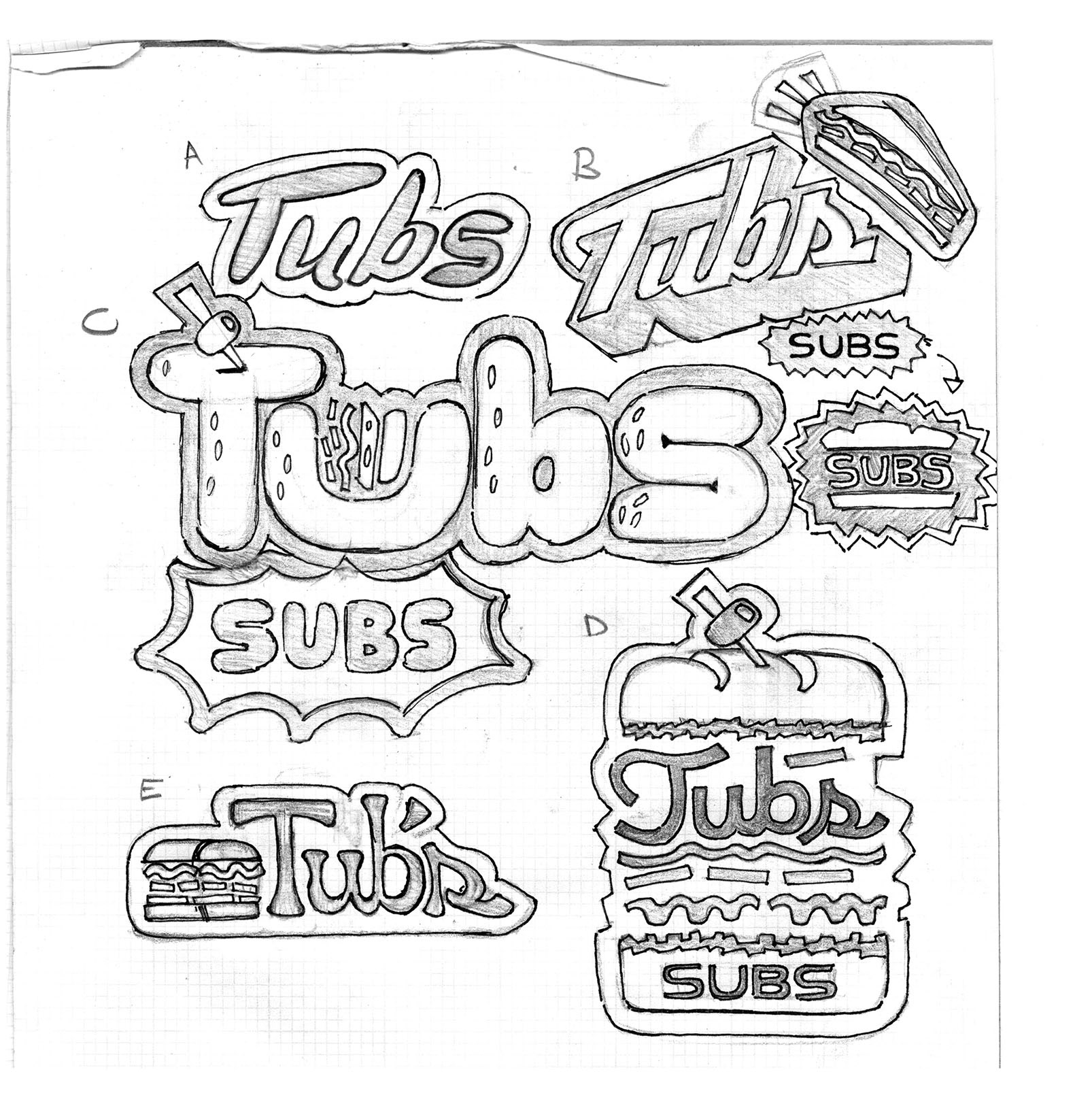
I felt that the current brand voice could benefit from a hand-lettered type solution. These initial sketches were drawn up after doing lots of mood-boarding. At this point, I was sketching with two different directions in mind.
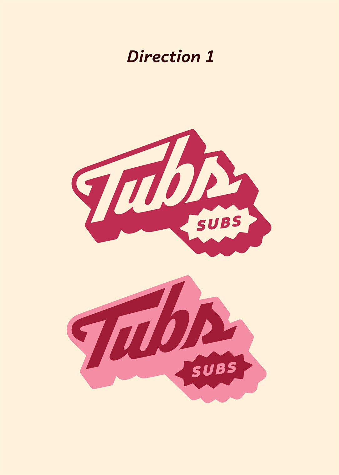
Direction 1 was "The Old School Advert." This direction had nostalgic appeal, calling back to 1950's Americana and hand-lettered sign-painting. This direction would appeal to Tubs' values of friendliness, by introducing a whimsy and sentimentality to the brand. The directness of this approach would also allow the brand to show off the flavorful variety of sandwiches to choose from.
Direction 2 was "The Modern World." This direction would use bold, colorful, experimental display type paired with sober sans serif body copy and vector illustrations. This direction would be intentionally loud and modern, appealing to a younger demographic while also giving the brand an unforgettable aesthetic that would compliment the large variety of options and the bold flavor palettes of the sandwiches.

EARLY LOGO DESIGNS
Based off of the previous sketches, I made 1 revised logo for each direction. Direction 2 (The Modern World) had some nice charm, and had clean simple graphics that could easily be built into a system of pattern designs. However, direction 2 ran the risk of feeling a bit literal and obvious. It also didn't feel as bold or experimental as I imagined it to be in my concept statement.
By comparison, Direction 1 (The Old School Advert) had a nice sense of motion, and it contained a charm that felt more clear in it's trajectory. It also felt more friendly and memorable than Direction 2, as it had a more iconic silhouette. Therefore, I decided to move forward with Direction 1.
LOGO REFINEMENTS
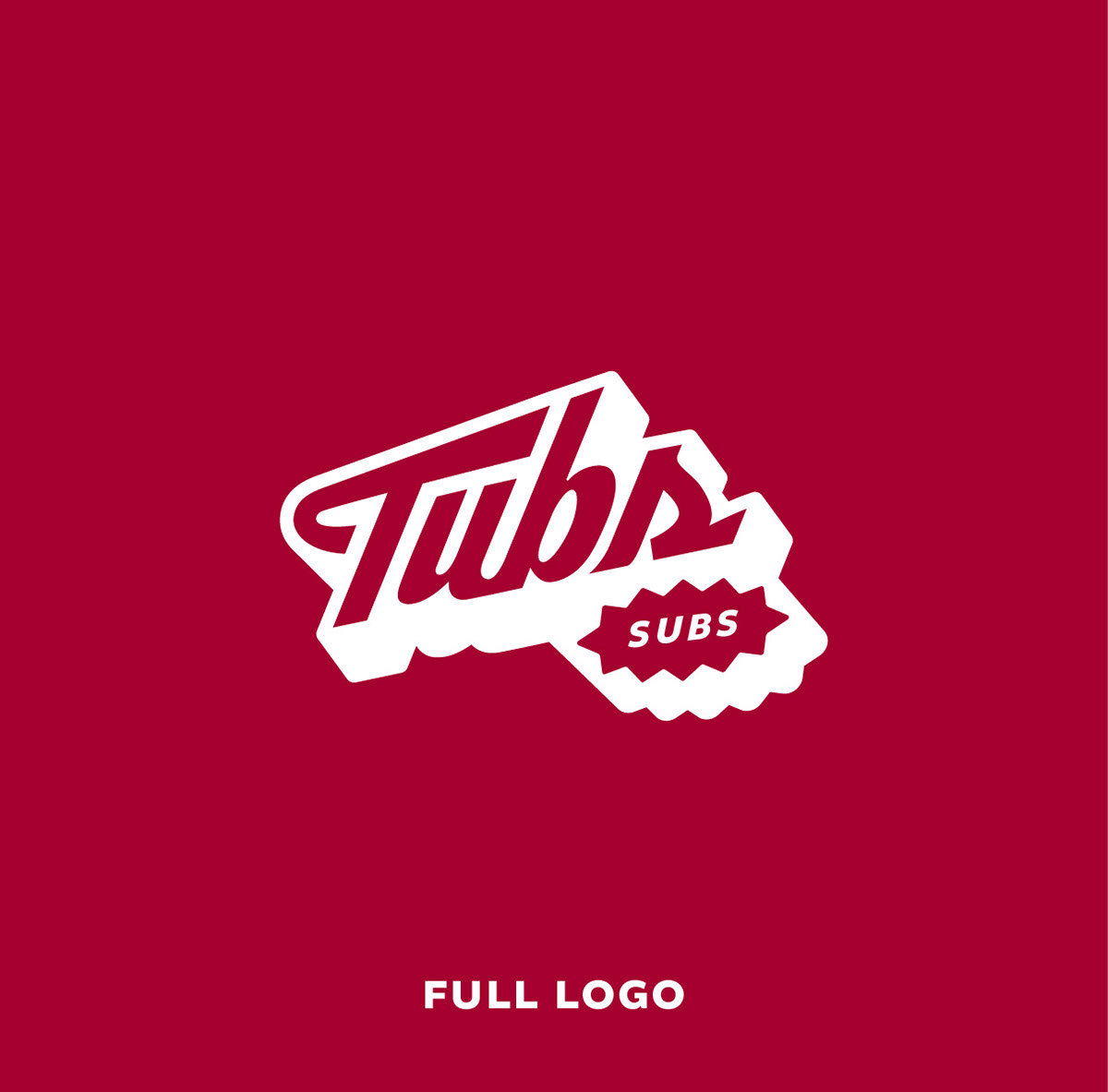
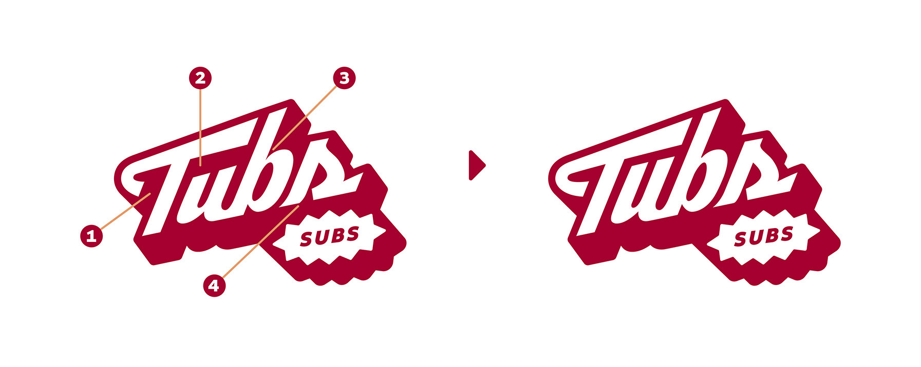
after choosing my direction, I refined the logo. This process included closing strange pockets of negative space, rounding out any sharp edges, and aligning all characters along a consistent x-height. I feel that these little changes drastically heightened the quality of the final logo.
MENU WIREFRAMES
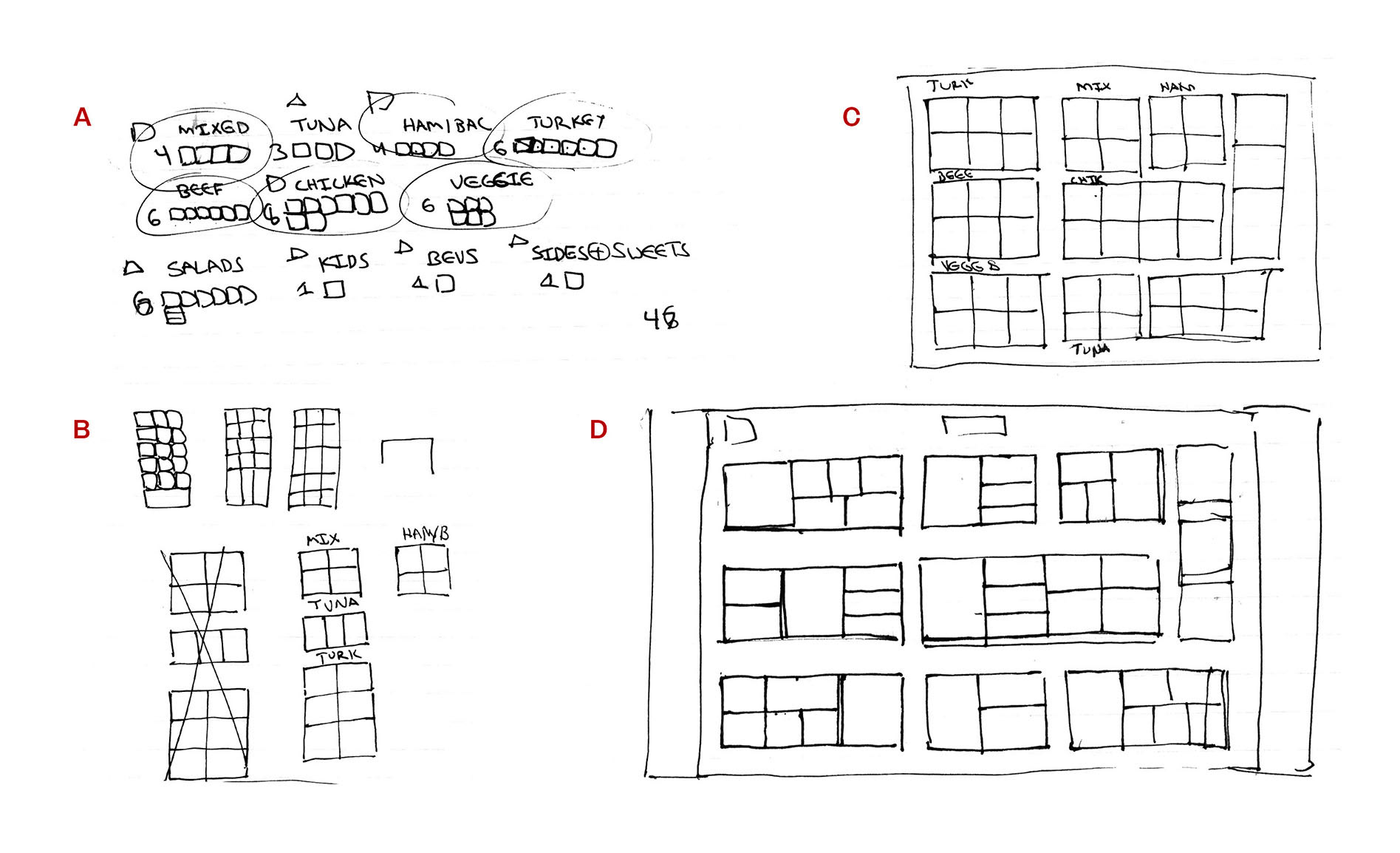
When designing the menu, I had a lot of different individual items to organize. Therefore, I did wireframe sketches to get a better sense of the layout before I hopped on Illustrator.
In section A, I began to organize the amount of menu items in each section, to get a full tally. In section B, I start framing out ideas for a tri-fold display menu. Then, in section C, I felt that a grid layout would work better, spread out over a single sheet. However, my issue was that the groupings had no sense of excitement.
One inevitable result of having such a large selection is that the customer will experience varying degrees of option paralysis. As a result, I felt that creating hierarchy within each section was important. Therefore, I landed on offering people one discounted menu item per section, to ease the burden of choice when making a split decision. As a result, section D was the final wireframe, containing one hero section within each category.


