SYMPHONÈ
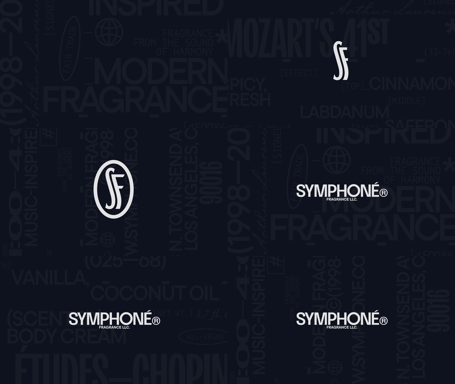
In this project, I created a sleek, modern brand for a fragrance company whose scents are intimately tied to the world of music. This particular project is a fictional brand, founded on the concept of synesthesia, a fundamental overlapping of the senses. What does music smell like?
SKILLS
Branding, Typography, Typesetting, Layout Design & Web UI.
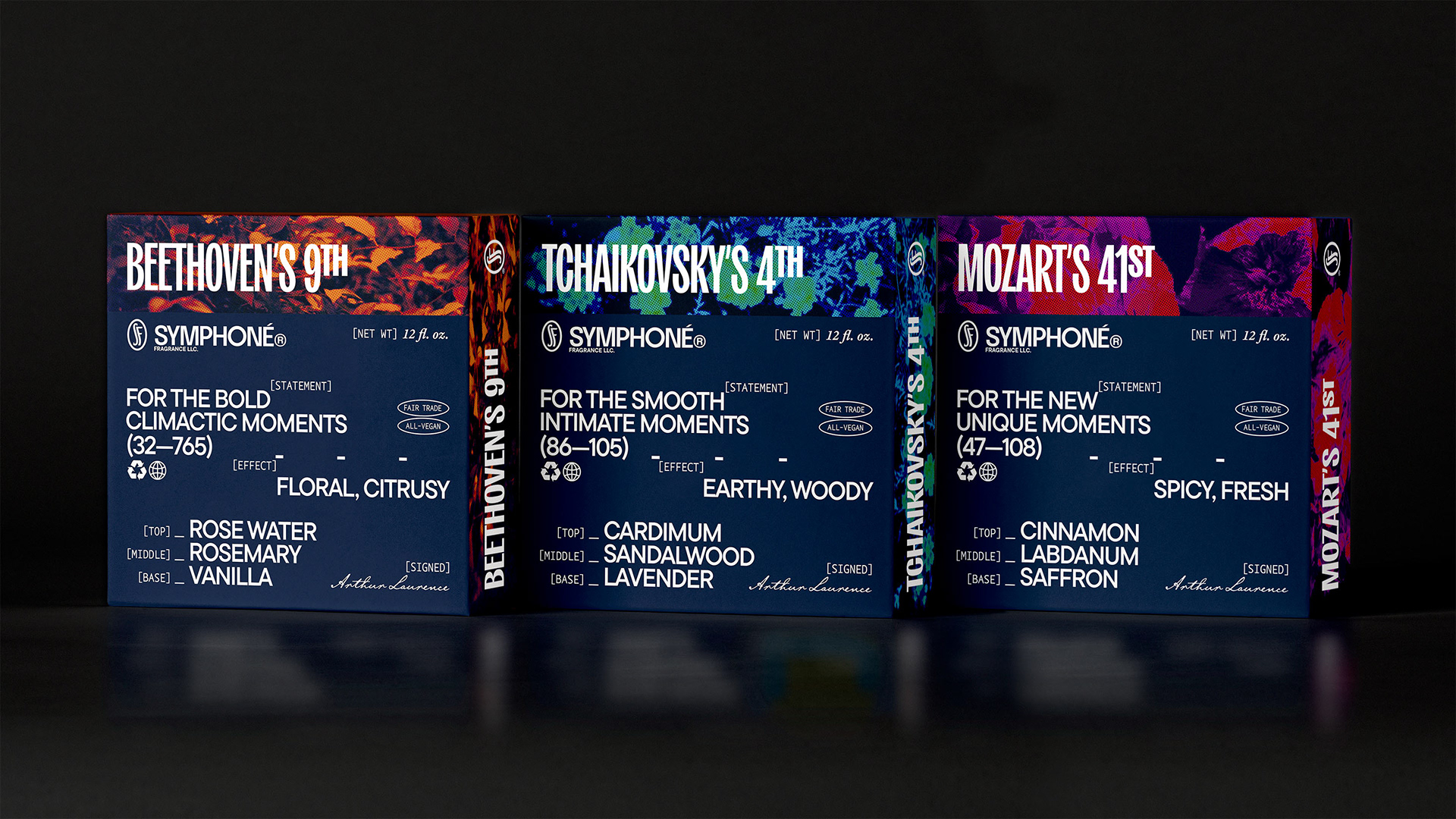
EXTERIOR PACKAGING DESIGN
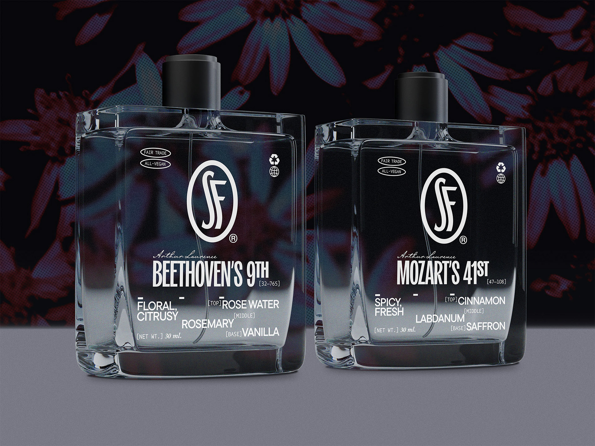
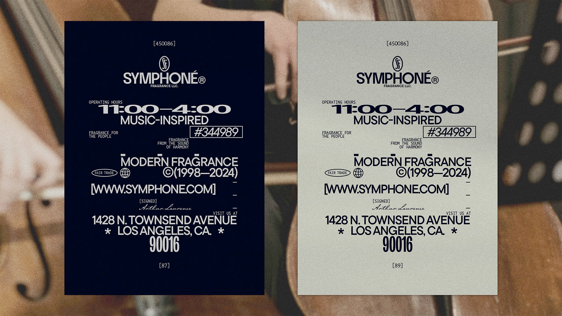
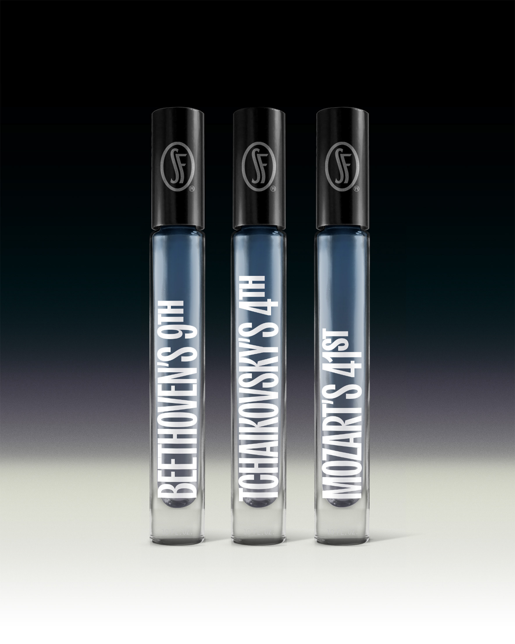
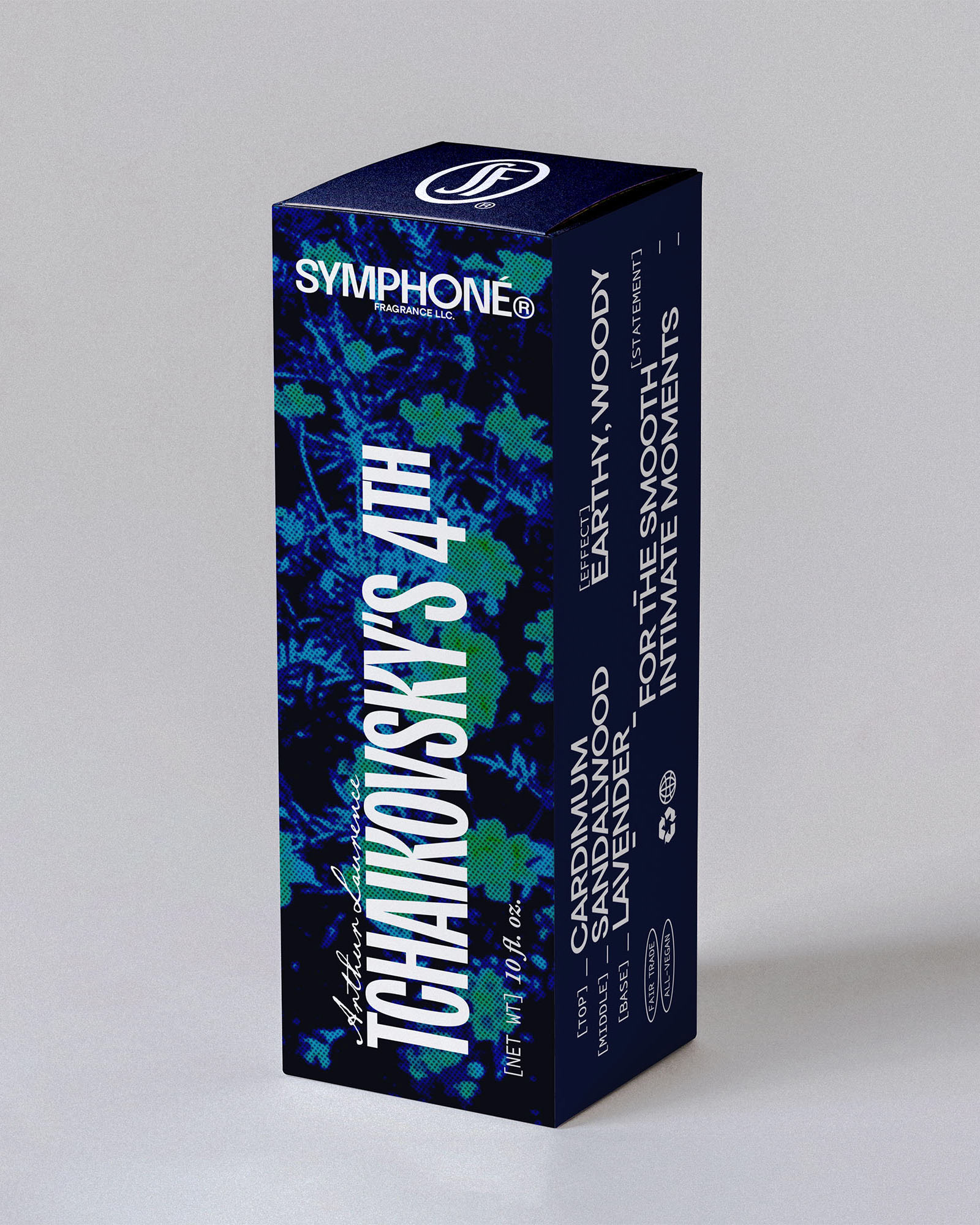
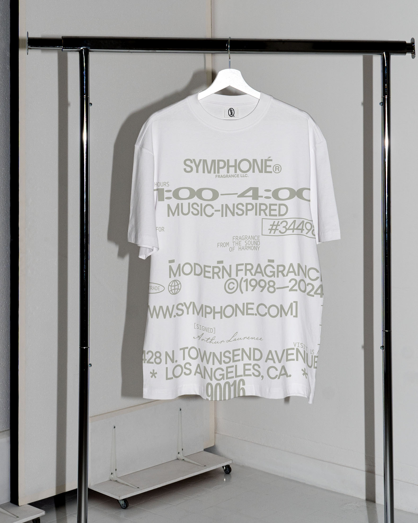
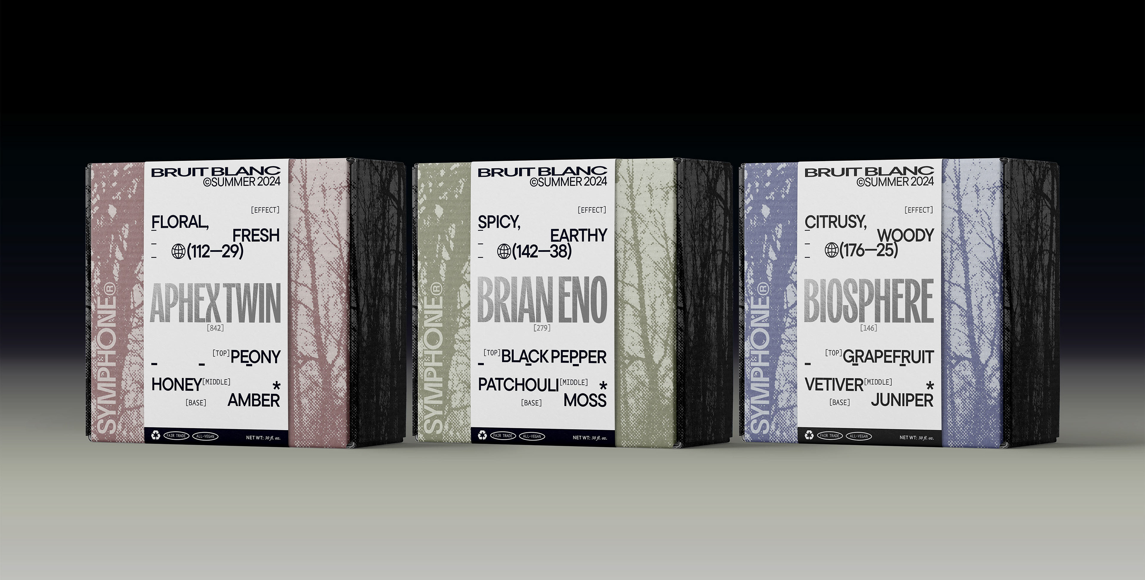
FALL RELEASE PRODUCT LINE: THE AMBIENT SERIES
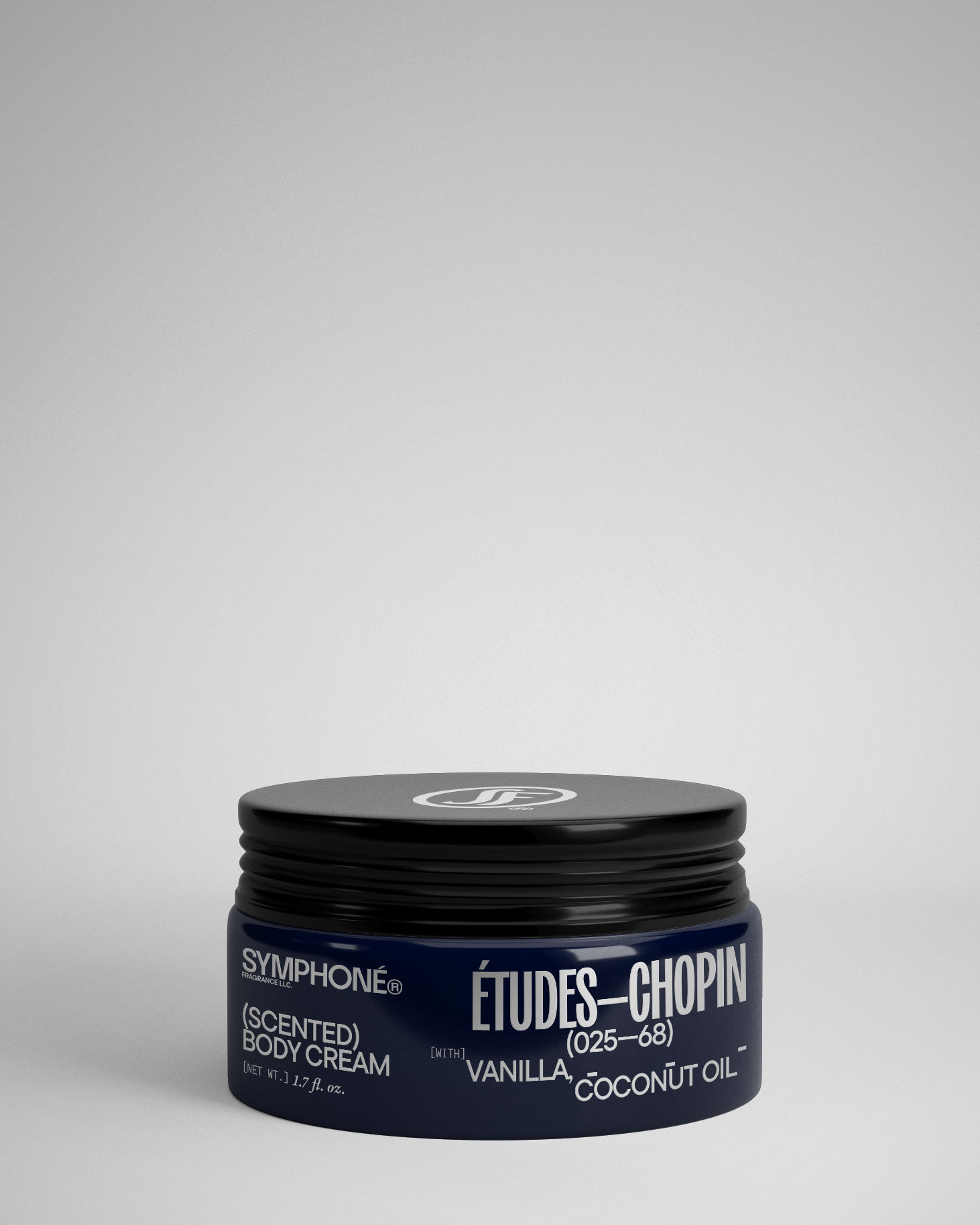
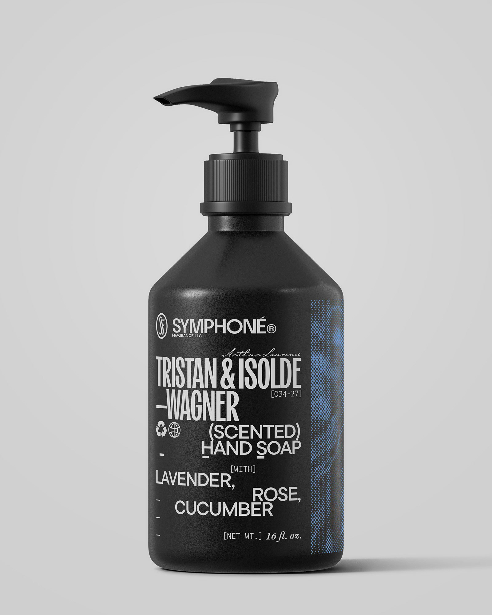
NEIGHBORING PRODUCT LINE: BODY CREAMS & HAND SOAPS
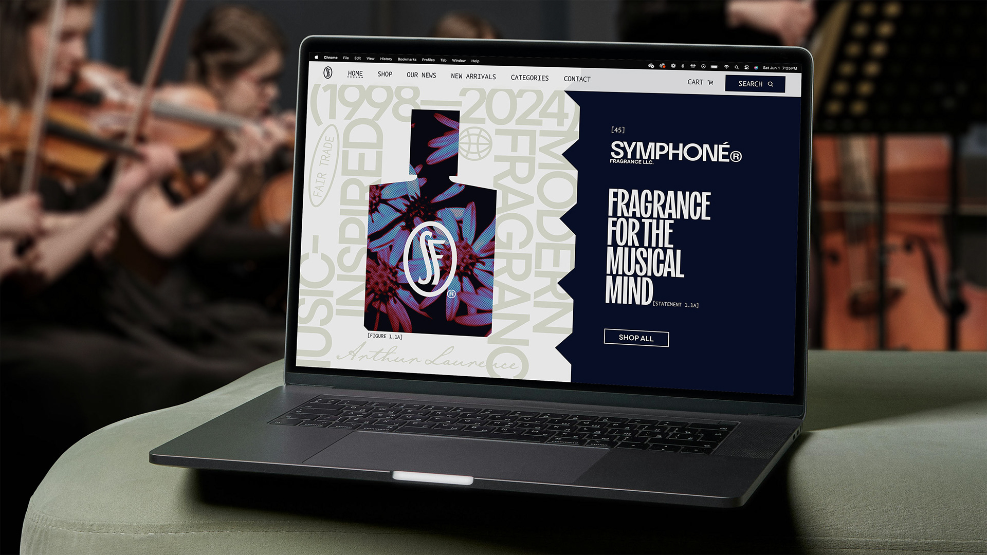
WEBSITE: HOME PAGE
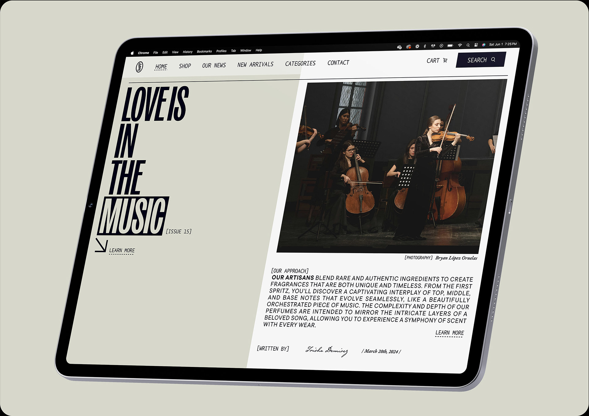
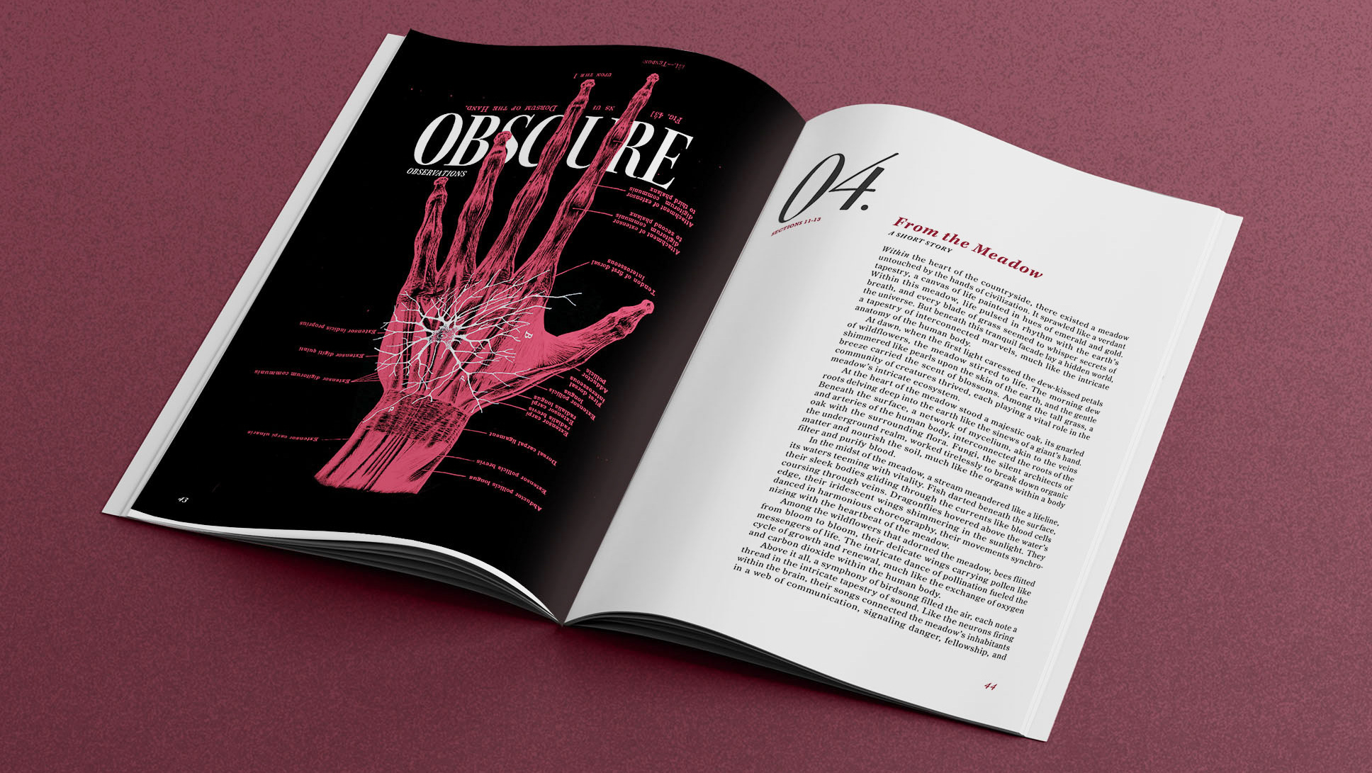
WEBSITE: JOURNAL ARTICLE
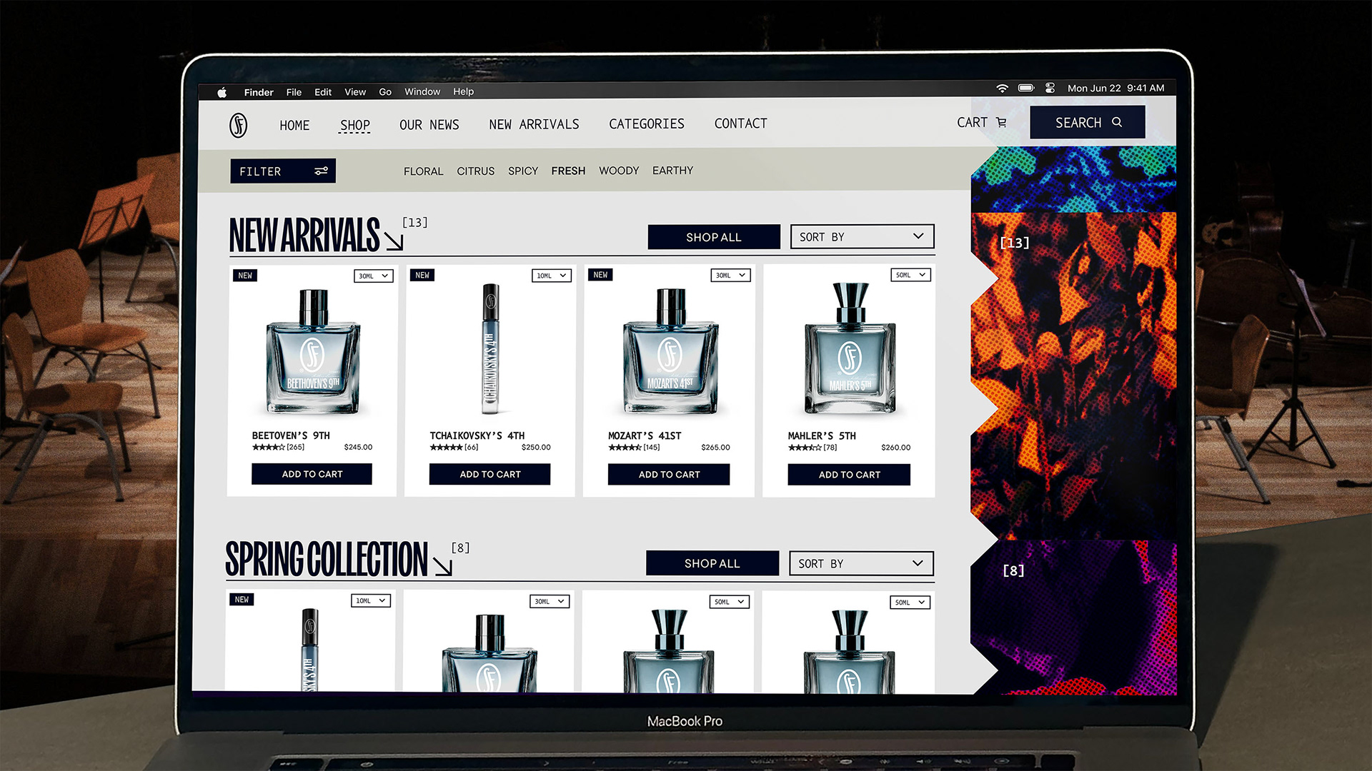
WEBSITE: E-COMMERCE PAGE
DESIGN PROCESS
One goal I had with this brand was to merge the modern with the classical. Bringing a very modern and on-trend approach to a subject rooted so deep in tradition was something that excited me.
The original concept for this brand came from the idea that people have a personal relationship with their fragrances. They have specific tastes, and they're proud of that. By comparison, music acts on the senses in a similar way, and people are equivalently proud of their taste in music. In addition, both classical music and luxury fragrance share a similar level of prestige and sophistication.
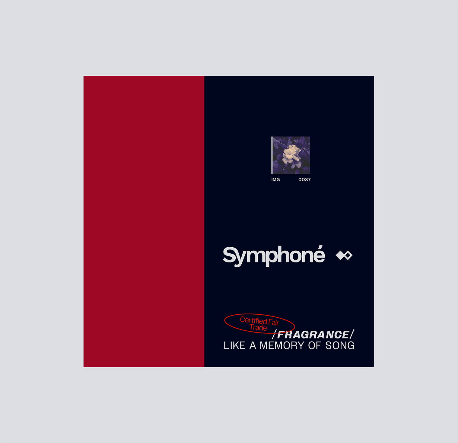
EARLY CONCEPTS
At this stage, I was simply experimenting with layout, and seeing what role photography would play in the brand. I knew I wanted to go with something elegant, yet a bit cryptic and delicate. I wanted to play with the consumers expectations, and draw them in through experimental compositions.
LOGO EXPLORATIONS
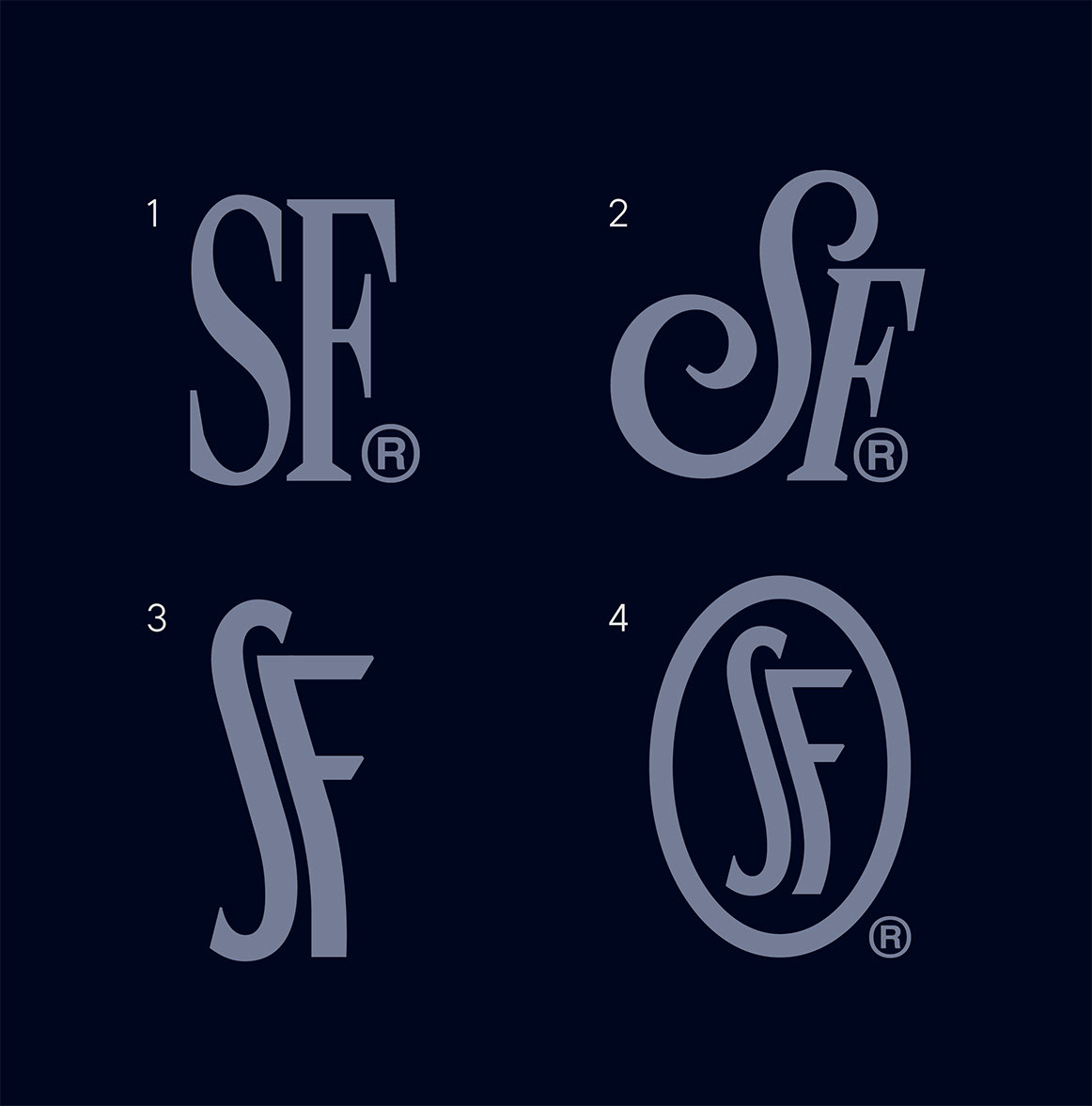
I knew I wanted a monogram version of the logo, that was simple yet instantly recognizable. In 1) and 2), I was playing with various serif fonts, as well as seeing what combining serifs with scripts would look like. However, there was something a bit un-remarkable and corny about those options. Then, in option 3, I found a nice tall sans-serif (WHT Unit Gothic), and I manipulated the F to match the arc of the S. There was something so unexpected about curving an F's stem in this manner, so it instantly worked for me. In section 4, I tightened up the F's curve and added a container oval. These final tweaks added more visual balance to the final monogram's design.
PACKAGE THUMBNAIL
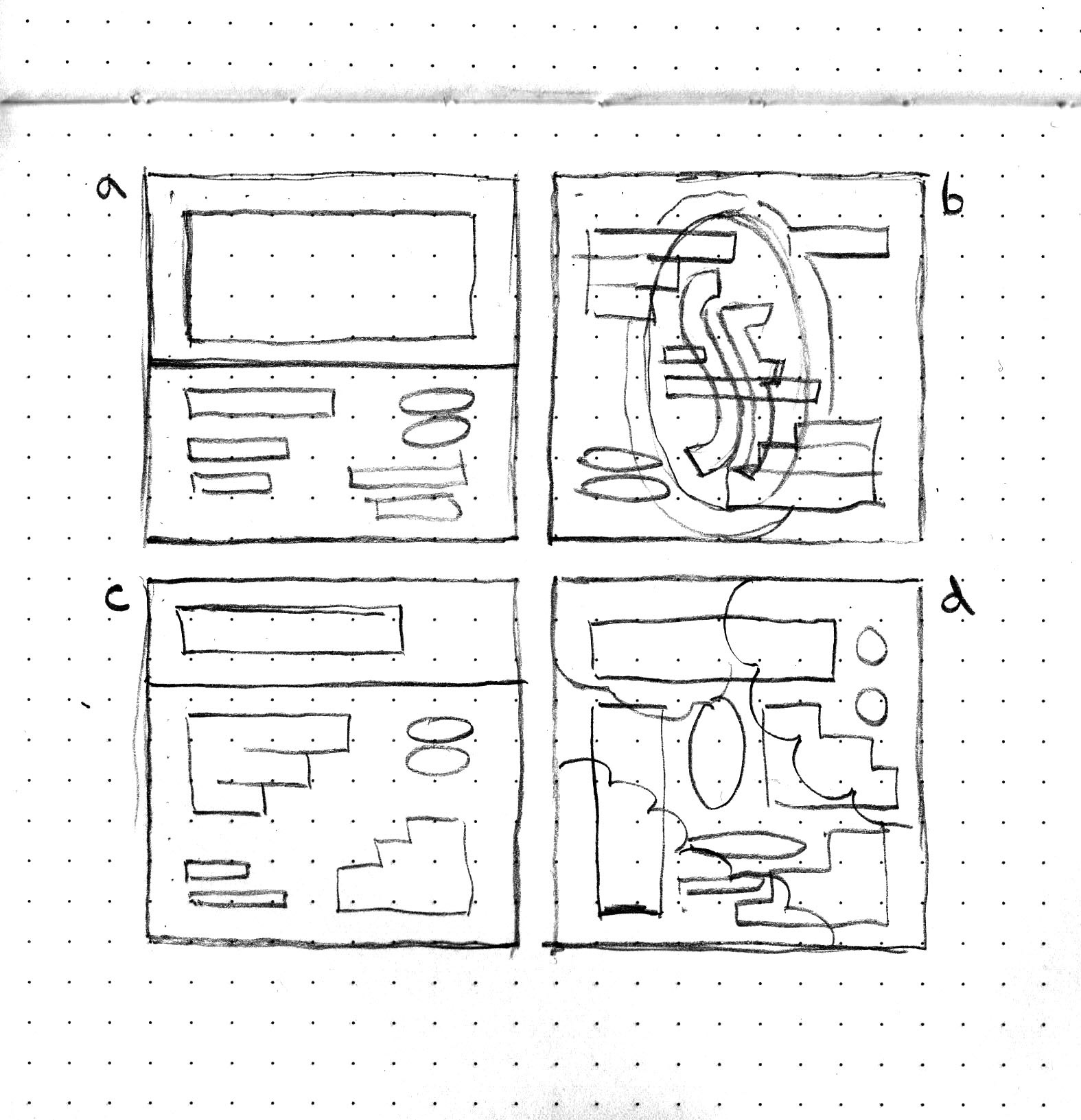
When I was planning the packaging, I had a lot of different potential layouts in mind. I knew I wanted to incorporate stylized nature photography, to serve as a vibrant visual representation of each fragrances' scent. However, I wasn't sure how visually active I wanted the layout to be. In a), I explored the idea of the title taking up half the package, and in b) I considered incorporating the emblem as an oversized background element. Then, in d) I considered having photography taking up the entire background, with the type existing in an experimental lockup. However, In the end I ended up going with c). I chose option c because the package needed to prioritize readability and functionality over everything else. Having clear type hierarchy and breathing room between elements meant that the consumer could easily understand what they were purchasing, while still experiencing the brand's style in a way that didn't overpower the function of the specific touchpoint.
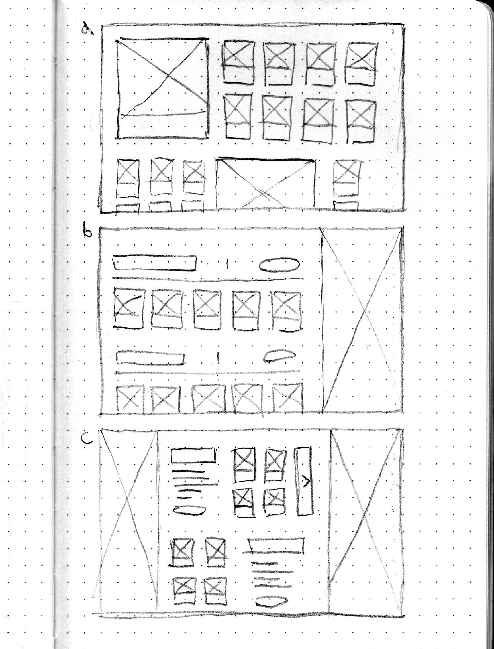
E-COMMERCE LAYOUT WIREFRAMES
When making the e-commerce wireframes, I had a few things to keep in mind. For one, I wanted to make sure that this touchpoint was the brand at it's most simple and functional. I also knew that I wanted the products themselves to be the most visually enticing elements on the page. With a), I experimented with having hero fragrances, that hierarchically emphasized particular products over others. Then, In c) I experimented with having written descriptions for each section, before showing the fragrance options. However, in the and I ended up going with b) for its simplicity. After conducting some user research, I also found that b) was the easiest for people to understand and navigate.
